↧
Infrared SFRplus test charts available now
↧
Slanted Edge Noise reduction (Modified Apodization Technique)
For measurement of sharpness, the main driver of variation is noise. A powerful noise reduction technique called modified apodization is available for slanted-edge measurements (SFR, SFRplus, eSFR ISO and SFRreg). This technique makes virtually no difference in low-noise images, but it can significantly improve measurement accuracy for noisy images, especially at high spatial frequencies (f > Nyquist/2). It is applied when the MTF noise reduction (modified apodization) checkbox is checked in the SFR input dialog box or the SFRplus or eSFR ISO More settings window.
Note that we recommend keeping it enabled even though it is NOT a part of the ISO 12233 standard. If the ISO standard checkbox is checked (at the bottom-left of the dialog boxes), noise reduction is not applied.
The strange word apodization* comes from “Comparison of Fourier transform methods for calculating MTF” by Joseph D. LaVeigne, Stephen D. Burks, and Brian Nehring, available on the Santa Barbara Infrared website. The fundamental assumption is that all important detail (at least for high spatial frequencies) is close to the edge. The original technique involves setting the Line Spread Function (LSF) to zero beyond a specified distance from the edge. The modified technique strongly smooths (lowpass filters) the LSF instead. This has much less effect on low frequency response than the original technique, and allows tighter boundaries to be set for better noise reduction.
*Pedicure would be a better name for the new technique, but it might confuse the uninititiated.
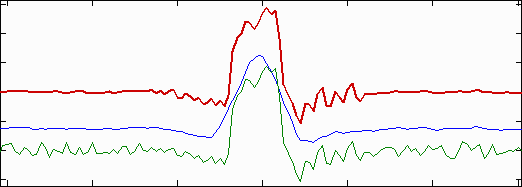
Modified apodization: original noisy averaged Line Spread Function (bottom; green),
smoothed (middle; blue), LSF used for MTF (top; red)
↧
↧
Microsoft Lync Logo selects Imatest

Imatest is the standard test software used in the recently published Microsoft USB peripheral requirements specification entitled “Optimized for Microsoft Lync Logo”, which can be downloaded here.
↧
Region Selection bug workaround
Symptoms of problem:
Upon selection of a region of interest, program stops working, either not responding or crashing.
DOS window error messages:
- Operation terminated by user during pause (line 21) In newROI_quest
- Undefined function or method ‘figure1_KeyPressFcn’ for input arguments of type ‘struct’.
-
Error while evaluating figure KeyPressFcn – Segmentation violation detected
Source of problem:
automatic translation software such as 有道首页 (Youdao Dictionary) and 金山词霸 (PowerWord)
Solution to problem:
Temporarily disable the translation software while performing a ROI selection
We will be working to make our software compatible with these sorts of translation programs in the future, as well as improving our own internationalization. Sorry for the inconvenience.
↧
Measuring Test Chart Patches with a Spectrophotometer
Using Babelcolor Patch Tool or SpectraShop 4
This post describes how to measure color and grayscale patches on a variety of test charts, including Imatest SFRplus and eSFR ISO charts, the X-Rite Colorchecker, ISO-15729, ISO-14524, ChromaDuMonde CDM-28R, and many more, using a spectrophotometer and one of two software packages.
- Babelcolor PatchTool which works with reflective test charts
- Robin Myers SpectraShop 4 which works with both reflective and transmissive (backlit) test charts
Measurement results are stored in CGATS files, which can be used as reference files for grayscale and color chart analysis in Multicharts, Multitest, Colorcheck, Stepchart, and SFRplus. In many cases, custom reference files provide more accurate results than the default values.
In addition, Argyll CMS is a free, Open Source, command line-based package that can be used for a number of measurements, including illumination intensity and spectrum. See the Argyll CMS documentation for more details.
Spectrophotometer
At Imatest we currently use the i1Basic Pro 2 (a good choice if you’re shopping for a new instrument; ). We’ll call it the i1Pro in the text below. It’s one of several instruments supported by Babelcolor PatchTool and Robin Myers SpectraShop 4 software. The i1Pro is primarily designed for reflective readings, but it can also be used to measure transmissive (backlit) charts.
- If you don’t have the original disk, Load the drivers and software from X-Rite. For our i1Pro we clicked on Software downloads (5 Items) (on this page), and loaded all relevant software. For the i1Basic Pro 2, go to this page.
- Install the drivers for your system and i1Diagnostics. Run i1Diagnostics to make sure your hardware is functioning properly.
- The other programs for the i1Pro are useful for purposes such as monitor calibration, but not directly relevant to chart calibration/patch measurement.
Babelcolor Patch Tool
Read the description of PatchTool on the Babelcolor page, then download and install it. You’ll need to purchase it in order to run Patch-Reader (no luck with evaluation mode). Registration is straightforward (no special instructions needed).
- Open PatchTool. The window is very simple— not much to it.
- Click Tools, Patch-Reader… to open the Patch-Reader…
- Select the Chat type. Click Custom chart for rectangular grid charts (like the X-Rite Colorchecker), and select the correct number of rows and columns. The default is 4 rows, 6 columns (for the Colorchecker). Select 4 rows, 5 columns for SFRplus color and grayscale charts. Unconstrained measurements work perfectly well for rectangular grid charts and must be used for charts that don’t have a regular rectangular grid (like the ISO-15739, CDM-28R, etc.). The Patch-Reader window will look like this.
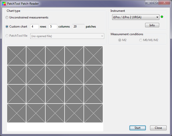 Initial Patch-Reader window (4 rows, 5 columns)
- Press Start. A window opens with the following message for calibrating the spectrophotometer. Follow instructions and press .
| REFLECTANCE CALIBRATION: Remove the AMBIENT DIFFUSER if installed. Place the i1Pro on its BASE (white tile). When ready, press the ‘Return’ or ‘Enter’ keys or close this message window.NOTE: This calibration may take several seconds!
|
- After you finish the calibration, and buttons appear on the lower-right of the Patch-Reader window.
- Place the i1Pro on the first patch of the chart and click the button on the side. This is equivalent to pressing (which should never be necessary).
- Now go through the patches one-by-one, by rows (for rectangular charts). For non-rectangular charts you’ll need to know the patch order, which is described below. For rectangular grid charts the Patch-Reader window will displays the location of the next patch to measure. Be sure to position the i1Pro carefully over the center of the patch and press it firmly against the target to minimize stray light. (Subdued room light doesn’t hurt.) (For a m row x n column chart, the order is Row 1-Col 1, Row 1-Col 2, … Row 1-Col m, Row 2-Col 1, etc.)
| A little inconsistencyAlthough you enter patches by rows (R1C1, R1C2, …, R1Cn, R2C1, … R2Cn, …) at Patch-Reader’s prompting, the patches in CGATS files (created using Custom chart: m rows x n columns) are stored by columns: (R1C1,R2C1, …, RmC1, R1C2, …, RmC2, …). This is NOT consistent with CSV files, which are stored by patch order, i.e., rows (R1C1, R2C2, …R1Cn, R2C1, … R2Cn, … for rectangular charts). Imatest recognizes the file type (CSV or CGATS) and interprets the patch order correctly (using the LGOROWLENGTH setting in CGATS files). |
- You can use the mouse to select a patch to measure, i.e., you can go back and re-measure if you have any doubts about measurement quality.
- When you have finished the Patch-Reader window will look like this. You should examine this image carefully to be sure it resembles the chart— all patches should look correct: You can still select patches to re-measure if necessary.
 Patch-Reader window after all patches have been read
- Click , and the a window appears with the following options.
| Do youl want to Save these measurements?Click ‘Cancel’ to continue making measurements.
|
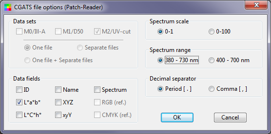
- When you click , the following window appears. For typical Imatest use, only the L*a*b* data field needs to be checked. ID (SAMPLE_ID; the numeric sequence) and Name (SAMPLE_NAME; The alpha column and numeric row, i.e., A1, …, A4, B1, …, F4) may be checked, but will be ignored by Imatest. XYZ and xyY may be checked, but will be ignored if L*a*b* is checked. (The order of precedence in reading data is L*a*b*, XYZ, then xyY.)
- The save file name should include the media type (matte, luster, …) and any other information needed to identify the chart.
PatchTool writes files in CGATS format (an industry standard best explained in the PatchTool Help PDF document). Imatest can read CGATS files starting with August 2013 3.10 builds. Here is an example:
CGATS.17
ORIGINATOR    "BabelColor PatchTool, version 4.1.0 b321"
LGOROWLENGTH    4
CREATED    "2013-07-01"  # Time: 1:25:46 PM
INSTRUMENTATION    "i1Pro"
INSTRUMENT_SN    "608994"
MEASUREMENT_SOURCE    "Illumination=D50 ObserverAngle=2 WhiteBase=Abs Filter=UVcut"
ILLUMINATION_NAME    "D50"
OBSERVER_ANGLE    "2"
FILTER    "UVcut"
MEASUREMENT_CONDITION    "M2"
WEIGHTING_FUNCTION    "ILLUMINANT, D50"
WEIGHTING_FUNCTION    "OBSERVER, 2 degree"
KEYWORD    "DEVCALSTD"
DEVCALSTD    "XRGA"
#
# THIS FILE CONTAINS REFLECTANCE MEASUREMENTS MADE WITH PatchTool Patch-Reader
#
# Chart_type: "Custom chart"
# No_rows: 4
# No_columns: 5
# No_samples: 20
#
NUMBER_OF_FIELDS    3
BEGIN_DATA_FORMAT
LAB_L    LAB_A    LAB_B
END_DATA_FORMAT
NUMBER_OF_SETS    20
BEGIN_DATA
44.050    -4.479    -15.534
46.989    3.638    -16.591
38.129    6.395    6.321
52.539    -0.730    -3.700
40.766    32.354    14.498
42.772    -19.174    -21.994
57.309    12.668    12.012
53.507    1.771    3.460
47.533    -25.359    16.443
44.629    32.242    -6.113
61.667    -18.258    37.479
37.817    2.403    -27.741
33.075    4.416    -29.699
75.079    4.192    62.638
63.637    15.573    46.478
45.767    28.423    10.312
41.007    -8.057    10.701
59.762    -28.214    -1.841
55.213    23.810    34.126
33.661    10.341    -10.492
END_DATA
SpectraShop 4
Download and purchase SpectraShop 4 using links at the bottom the product description page. Both Windows and Mac versions are available. The brief Tutorials are recommended. You should also download the full PDF manual and look at the FAQ, which has troubleshooting information. Open SpectraShop 4. Click on the Measure specimens box, which is the second from the left. (I’ve tried Create and edit charts and Measure chart without luck.)
|
This opens the Instrument Connection window, shown on the right. Select the spectrophotometer, click , select the Specimen Type (reflective, transmissive, etc.). Be sure the spectrophotometer is on its base (with white tile), then press . Instrument Connection window, shown just before Calibration |
 |
|
After Calibration is complete, the Measure Reflective Specimens page will open. None of the settings are critical, but we recommend
When you have finished making settings, press . Place the spectrophotometer sensor over the patch. If possible the room should be dimly lit to minimize light leakage. Take each reading by clicking the spectrophotometer button— waiting about two seconds for a beep indicating that the reading is complete. Patch order is described below. Take readings carefully. I haven’t (yet) found a convenient way to edit or redo erroneous readings. Saving the reference fileI recommend saving results in two formats: the default SpectraShop 4 ss3 format (not interchangeable, but can be reopened in Spectrashop 4), which contains all results (including the spectrum), and CGATS with just the results used by Imatest. To save the SS3 file, click (in the window shown below) File, Save… or Save as… The procedure for saving Imatest-readable CGATS files is shown below. |
 |

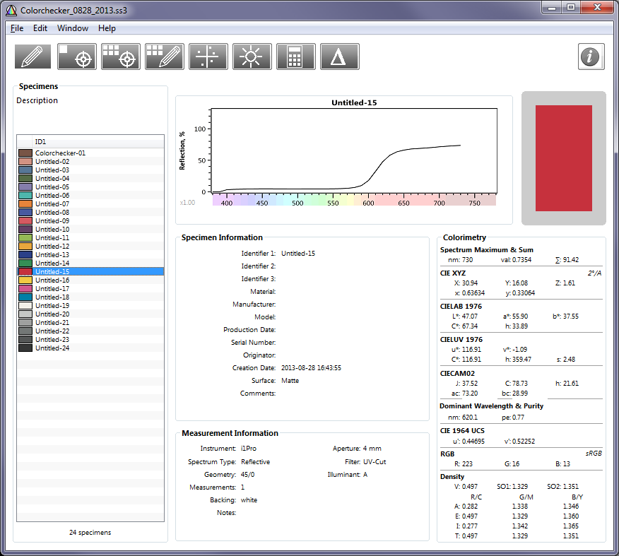 Main SpectraShop 4 window showing Colorchecker results

Spectrashop 4 Export window (for writing CGATS files)
To save the measurements in an Imatest-readable CGATS file, click File, Export… The window on the right opens. Select CGATS 1.7 ASCII as the Export Format. Spectrum should be unchecked and L*a*b* should be checked. XYZ and xyY may be checked if desired, but they will be ignored by Imatest if L*a*b* has been checked. Here are the results:
CGATS.17 ORIGINATOR “” CREATED “2013-08-28 16:43:55” INSTRUMENTATION “i1Pro” MEASUREMENT_GEOMETRY “45/0” MEASUREMENT_SOURCE “A” WEIGHTING_FUNCTION “OBSERVER,2 degree” WEIGHTING_FUNCTION “ILLUMINANT,A” NUMBER_OF_FIELDS 4 BEGIN_DATA_FORMAT SAMPLE_ID LAB_L LAB_A LAB_B END_DATA_FORMAT NUMBER_OF_SETS 24 BEGIN_DATA “Colorchecker-01” 39.80 14.43 17.09 “Untitled-02” 67.86 22.51 20.21 “Untitled-03” 48.51 -9.36 -23.27 “Untitled-04” 43.04 -10.81 20.67 “Untitled-05” 54.88 5.55 -24.67 “Untitled-06” 68.04 -32.15 -6.00 “Untitled-07” 66.70 34.88 63.83 “Untitled-08” 38.48 -0.44 -45.06 “Untitled-09” 56.15 47.12 25.25 “Untitled-10” 31.91 17.66 -16.69 “Untitled-11” 71.40 -16.98 50.80 “Untitled-12” 74.84 21.00 71.57 “Untitled-13” 27.04 0.66 -49.03 “Untitled-14” 52.88 -32.25 23.97 “Untitled-15” 47.07 55.90 37.55 “Untitled-16” 83.99 9.76 78.29 “Untitled-17” 55.75 47.38 -5.30 “Untitled-18” 47.53 -31.32 -35.23 “Untitled-19” 95.01 0.32 4.03 “Untitled-20” 80.78 -0.72 0.38 “Untitled-21” 66.36 -0.71 0.28 “Untitled-22” 49.81 -1.43 -0.39 “Untitled-23” 36.00 -0.85 -0.45 “Untitled-24” 20.92 -0.34 -0.53 END_DATA
Patch order
Charts with a regular m x n rectangular grid have patches numbered in a sequence shown in the example below for the 4 row X 6 column X-Rite Colorchecker. This is the order you should use in acquiring patch data.
| 1 | 2 | 3 | 4 | 5 | 6 |
| 7 | 8 | 9 | 10 | 11 | 12 |
| 13 | 14 | 15 | 16 | 17 | 18 |
| 19 | 20 | 21 | 22 | 23 | 24 |
Several grayscale charts (ISO-15739, etc.) that don’t have regular m x n grids have their patch order listed in Special and ISO Charts. These charts are supported by Multicharts.
Charts supported by Multicharts. You can find the patch order by running Multicharts, selecting 3. Split Colors: Reference/Input (in Display), then checking the Numbers checkbox. This displays the patch numbers, as shown below for the DSC Labs CDM-28R.
 Multicharts result, showing patch numbers, for the ChromaDuMonde 28R.
| There are a few special cases, such as the Rezchecker (a tiny precision reflective chart for measuring color, tones, and MTF). The numbering follows the standard rectangular grid, but patches that have L* = a* = b* = 0 in their reference file are omitted from analysis. For the Rezchecker these include patches 1, 6, 8-11, 14-17, 37, and 42. |  Rezchecker Rezchecker |
 Rezchecker numbering Rezchecker numbering |
|
Some cases are not obvious, like the eSFR ISO color patches, which are supported by Multicharts, but usually run in eSFR ISO. eSFR ISO color patches |
 |
|
External Links
- Edmund Ronald’s Blog
- i1Basic Pro UVcut – predecessor to the i1Basic Pro2
↧
↧
Sharpness and Texture Analysis using Log F‑Contrast from Imaging-Resource
Imaging-resource.com publishes images of the Imatest Log F-Contrast* chart in its excellent camera reviews. These images contain valuable information about camera quality— how sharpness and texture response are affected by image processing— but they need to be processed by Imatest to reveal the important information they contain.
*F is an abbreviation for Frequency in Log F-Contrast.
I was motivated to write this post by my curiosity about the 36-megapixel mirrorless full-frame interchangeable-lens Sony Alpha A7R and how its image quality compares to competitive cameras (as well as cameras I now own). A post on Imaging-Resource.com says,
“In our initial press briefing, Sony made quite a big deal about its new sharpening algorithms, designed to reduce what they call “outlines” — which we’ve called “halos” for some years now. The images shown in that briefing were certainly impressive, but it’s hard to judge when there’s no standard of comparison against other cameras shooting the same scenes under controlled conditions. We had to see how it did on our own standardized studio shots before we could pass final judgment.
We’ve now done just that, and have to say we’re pretty well blown away by what we saw. Check our Sony A7R review page for our initial image comparison analysis…”
I will compare objective measurements from Log F-Contrast chart images. These provide a useful quantitative supplement to Imaging-Resource’s subjective (but vital) camera comparisons that use still-life images, enabling us to accurately asses Sony’s claim of sharpening without “halos”, to examine how noise reduction affects fine detail, and to compare different types of cameras. I’ll report on cameras of particular interest to me as well as cameras that I own.
| Sony A7R | Intriguing because of its high resolution (36-megapixels), small size and light weight for a full-frame camera, and lack of mirror. Small pixel size (relative to total field) allows anti-aliasing filter to be eliminated. |
| Pentax D645 | Standard of comparison. Medium format. Large, heavy and relatively expensive. Known for excellent image quality. |
| Nikon D800 | Popular 36-megapixel full-frame DSLR. (A D800E image was not not available.) Heavier and larger than the A7R. |
| Canon EOS-6D | 20-megapixel DSLR. I own one. Makes excellent images using off-camera raw conversion. |
| Panasonic DMC-G3 | 16-megapixel mirrorless interchangeable camera with eye-level electronic viewer (which I appreciate because I can’t focus well on regular screens without reading glasses). |
| Panasonic DMC-LX7 | 10-megapixel high-end compact with Leica f/1.4 zoom lens. |
| Sony RX100 II | 20-megapixel high-end compact with Zeiss f/1.8 zoom lens. (Hits a sweet spot for size vs. quality) |
| Fuji XE-2 | 16-megapixel mirrorless interchangeable camera, eye-level electronic viewer, Fuji X-Trans sensor, which allows anti-aliasing filter to be eliminated. |
| Sigma DP1 Merrill | 14.8-megapixel compact camera with Foveon APS-C-size sensor. No Color Filter Array or anti-aliasing filter. Non-interchangeable prime lens. |
My quest may be familiar to many of you: a small lightweight camera that can produce images comparable to the large-format prints by Ansel Adams and Edward Weston that I saw at the George Eastman House when I was growing up in Rochester, NY. In a word, I’m looking for the holy grail— at an affordable price. A modest quest.
Imaging-Resource.com
Imaging-resource.com publishes outstanding camera reviews, indexed on their Camera Reviews page. To find the Log F-Contrast images, go to a review page (here for the Sony A7R), click on the Samples tab, then scroll down (about 3/4 of the way to the bottom for the A7R). Look for the Multi Target image. Click on a thumbnail taken at a low ISO speed to see the camera’s ultimate capability. Later you may want to load images taken at higher ISO speeds to see how signal processing changes the results (you’ll almost always see additional noise reduction that tends to reduce sharpness, especially in low-contrast regions). Here is an image Imaging Resource’s Multi Target, showing the Log F-Contrast chart just below the center.

Imaging-Resource Multi Target image
The Log F-Contrast chart
The Log F-Contrast chart increases in spatial frequency from left to right and decreases in contrast from top to bottom. (Actually the square of the contrast is proportional to the distance from the bottom, so contrast in the middle is 1/4 of the contrast at the top. This makes the chart look much better.)

Log F-Contrast chart image
Details of running the Log F-Contrast are given in Log F-Contrast instructions. We focus on results here. The image below shows the normalized MTF* for several rows in the chart from near the top (row 1 of 25) to about 80% of the way to the bottom (row 19 of 25). (MTF curves for rows below this are unreliable due to noise and low contrast.)
*MTF (Modulation Transfer Function), which is generally equal to SFR (Spatial Frequency Response)
is a measure of image sharpness, described in Sharpness: What is it and how is it measured?
Sony Alpha A7R
 Sony A7R: Normalized MTF for bands from just below the top to near the bottom
MTF (i.e., sharpness) is fairly consistent for rows 1 through 10 (the relatively high contrast portion near the top of the image), with no significant sharpening peaks (Sony’s claim of no “halos” is well-justified). The long MTF ramp is an indication of nicely done sharpening. Sharpness starts to fall at row 13 (1.7:1 contrast), and drops significantly for rows 16 and 19.
This is the result of noise reduction, which is equivalent to lowpass filtering (smoothing), and which depends on image content in most consumer cameras. Noise reduction is minimum (and its inverse, sharpening, i.e., high frequency boost, is maximum) near contrasty features— near the top of the chart. Noise reduction is strongest in smooth areas— in the absence of contrasty features— near the bottom of the chart.
|
Comparison with slanted-edge measurements Results from Log F-Contrast illustrate how sharpening increases with feature contrast in the JPEG output files of most consumer cameras. Slanted-edges tend to maximize sharpening, especially if they are contrasty. Imaging-Resource has an A7R image of the ISO-12233 chart, which has several high-contrast edges, making for a convenient comparison. The average edge and MTF are shown on the right. Results are quite close to row 1 of the Log F-Contrast results (blue curve, above) up to about 3000 LW/PH, but the slanted edge has higher MTF at higher spatial frequencies. It has quite a lot of energy above Nyquist, which is characteristic of a system with no anti-aliasing filter + a very sharp lens. This can be an indicator of aliasing (color moire), but none is visible in the image. This is very impressive performance. |
 |
Since the multiple MTF image (above) is somewhat difficult to interpret, Imatest produces a contour plot of normalized contrast (MTF) over the image. This plot clearly shows how MTF varies with chart contrast.

Sony A7R: Normalized contrast plot
This display is clearer than the MTF plot above: it contains results for all rows with sufficient contrast for MTF to be measured. It’s much easier to see how MTF drops as contrast decreases. It also displays key summary metrics: MTF50 (the spatial frequency where contrast falls to 50% of its low frequency value), MTF50P (the spatial frequency where contrast falls to 50% of its peak value), and comparable numbers for 20 and 10% contrast (which are more closely related to “vanishing resolution”). MTF50P is the most robust summary metric than MTF50: it is less sensitive than MTF50 to strong sharpening (not present here, but significant in the Canon EOS-6D).
Significant texture loss due to noise reduction is visible for modulation under 0.2 (chart contrast ratio under 1.7:1). This typical behavior for JPEG processing. If you want this detail you’ll have to convert raw images off the camera (with noise reduction turned down). The MTF50P values over 3,000 Line Widths/Picture Height are outstanding, particularly considering that there is no sharpening peak. With good technique you can expect razor-sharp 24×32 inch prints (the largest you can print in this format on a 24-inch printer)— and you can go a lot larger with excellent quality. How many photographers actually make larger prints?
Regarding Sony’s claim of an excellent sharpening algorithm with no (significant) halo, we know from slanted-edge analysis that MTF (spatial frequency response) peaks above 1 correspond to halos near edges, and that the strength of the halo is well correlated with the strength of the peak. Halos corresponding to MTF peaks under 1.1 (10% above the low frequency MTF) are generally too weak to be objectionable. So the verdict on the Sony A7R is yes, it lives up to its claims, but it’s hardly unique in that regard: the Pentax 645D, the Nikon D800 and some others (but notably not the Canon EOS-6D), also have excellent sharpening without a significant sharpening peak.
Pentax 645D
The 40-megapixel medium-format Pentax 645D is the camera to beat.
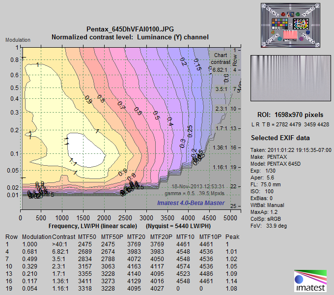 Pentax 645D: Normalized contrast plot
(Note that the horizontal scales are different for each plot: the maximum frequency is the Nyquist frequency.)
At high contrast levels the Sony does indeed beat the Pentax! But the Pentax appears to have NO noise reduction: MTF doesn’t drop until modulation gets down to 0.03— an extremely low level. The Pentax wins for reproducing extremely fine texture at modulation levels below 0.2. I would guess that a properly processed raw image from the Sony A7R would have comparable low-level detail (see the RX100 II raw image, below), though there might be more noise (which might not be objectionable at this ISO speed).
The Sony holds its own very well against the Pentax, which is particularly impressive considering its size, weight, and cost. The difference would only be noticeable in very large prints.
Nikon D800
Unfortunately I couldn’t find a Multi Target image for the D800E (the version without the anti-aliasing (optical lowpass) filter). This would have made for a much better comparison.

Nikon D800: Normalized contrast plot
(Note that the horizontal scales are different for most plots, but this is the same as the Sony A7R.)
Signal processing is quite similar to the Sony A7R, but MTF frequencies are about 15% lower, which is what you’d expect from the added anti-aliasing (optical lowpass) filter. We would expect performance comparable to the A7R with the D800E, which doesn’t have an anti-aliasing filter. Of course the lens could have some effect, though excellent lenses at or near optimum aperture have been used in both cases (and in other Imaging-Resource images). The lens is probably not the dominant factor here.
Canon EOS-6D
 Canon’s JPEG processing— and I mean sharpening, not JPEG compression— masks the 6D’s full performance potential. (It could probably be corrected in firmware if Canon wanted.) To begin with, the image is strongly oversharpened. Halos will be clearly visible in moderately large prints (as they are in IR’s image). And the sharpening radius is 2, which boosts middle but not the highest spatial frequencies (explained here). A sharpening radius of 2 is good for moderate enlargements with average quality lenses, but it’s hardly optimum when maximum quality is required. I never use JPEGs for high quality prints from the 6D; I always convert from raw and sharpen with a smaller radius with excellent results— I’ve made some outstanding 16×24 inch prints from the 6D.

Canon EOS-6D: Normalized contrast plot
(Note that the horizontal scales are different for each plot: the maximum frequency is the Nyquist frequency.)
Despite the sharpening, MTF50P is well below that of the Sony A3R. This is because of the way Canon’s sharpening (with radius = 2) works, boosting middle but not high spatial frequencies, and partly because the Sony has more pixels combined with an excellent lens and no anti-aliasing filter. With raw images the difference would be reduced, but the Sony is the clear winner here.
Panasonic Lumix DMC-G3
The G3 is a 16-megapixel Micro Four-Thirds mirrorless interchangeable system camera that I’ve had since 2011 (two years ago as I write this). It’s much smaller and lighter than than APS-C or full-frame DSLRs; it’s easier to carry on long trips.

Panasonic Lumix DMC-G3: Normalized contrast plot
(Note that the horizontal scales are different for each plot: the maximum frequency is the Nyquist frequency.)
MTF50P in the range of 2200 is respectable for a camera in this category, though not in the same class as the Sony, Pentax, and Nikon cameras above. There is a moderate sharpening peak— not enough to be objectionable in any viewing conditions. Noise reduction is strong for modulation under 0.2— pretty similar for most of the cameras in this post, except for the Pentax. I’ve made some very nice 18×24 inch prints with this camera, using an off-camera raw converter (though they’re not quite as good as processed raw images from the EOS-6D— not JPEGs).
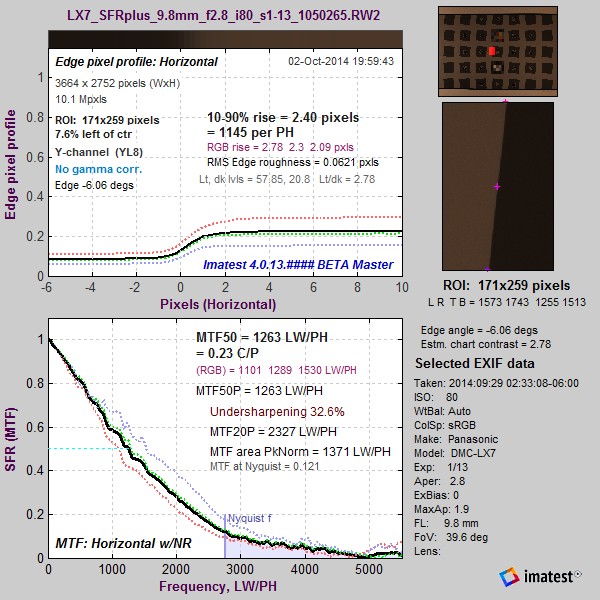
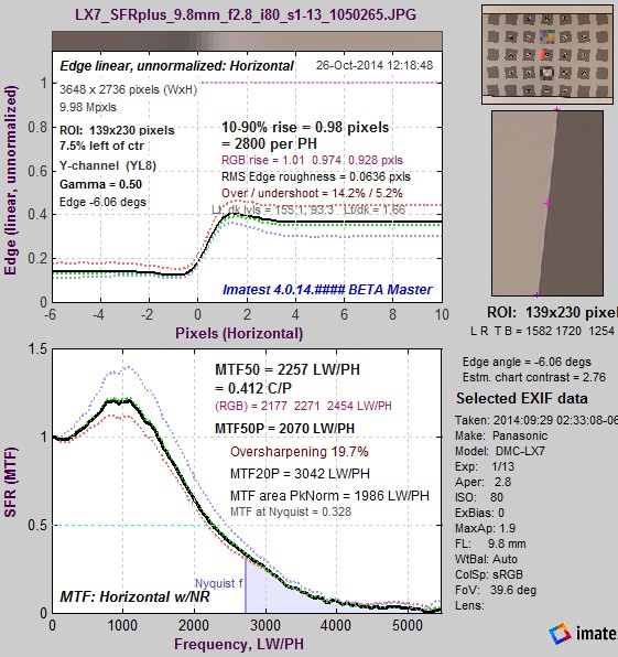
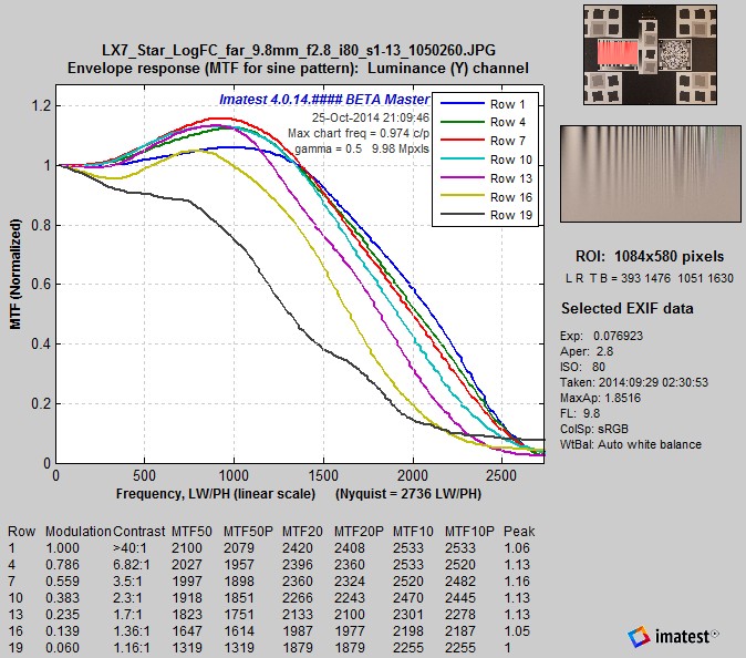
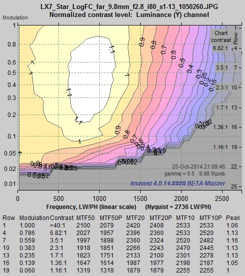
Panasonic Lumix DMC-LX7
Nobody, and I mean nobody, will take you for a serious photographer if you carry one of these little toy-like cameras. But appearances can be deceiving. A toy it is not. This 10-megapixel point and shoot (with an f/1.4 Leica zoom lens) is capable of some pretty impressive image quality for a slightly larger than pocketable point-and-shoot. I carry this camera when I’m feeling lazy but want to make fine images should the opportunity arise.

Panasonic Lumix DMC-LX7: Normalized contrast plot
(Note that the horizontal scales are different for each plot: the maximum frequency is the Nyquist frequency.)
Sharpening is rather strong, with the sharpening peak reaching 1.37, which might be objectionable in large prints. (Raw is available.) It might be a good idea to decrease sharpening from the default level. MTF50P above 2000 at high contrast levels is excellent for a 10 megapixel camera, thanks to an excellent lens and strong sharpening with radius R = 1 (which does a much better job than the R = 2 sharpening in the EOS-6D, as explained in the Sharpening page).
Sony RX100 II
My London son is absolutely delighted with his 20-megapixel RX100 (with a Zeiss f/1.8 zoom lens), which he first used to take pictures of the aurora borealis in Iceland (an application that requires excellent low light performance). It’s small enough to fit in most pockets (slightly smaller than the LX7). We’ll look at the RX100 II, which is the current model. It has a large (1-inch) sensor, unusual for such a small camera.

Sony RX100 II: Normalized contrast plot: JPEG image
(Note that the horizontal scales are different for each plot: the maximum frequency is the Nyquist frequency.)
Note that MTF50P for modulation above 0.1 is better than the Canon EOS-6D, despite the Canon’s strong sharpening. Impressive for a camera you can put in a pocket! Only at very low contrast does the big Canon out-perform the little Sony. The Sony is also quite a bit better (higher MTF50P with less sharpening) than the slightly-larger but less expensive Panasonic LX7.
The reduced MTF at very high modulation levels (above 0.8) is caused by signal processing— I’m not sure why. Imaging-Resource has supplied a raw (ARW) version of this image, which we converted using dcraw, which has no sharpening or noise reduction. Here is the plot, which shows a MTF falloff characteristic of an unsharpened image and vertical contour lines characteristic of no noise reduction

Sony RX100 II: Normalized contrast plot: raw (ARW) image converted by dcraw
The Sony RX100 II hits a real sweet spot: it’s small enough to fit in most pockets and capable of making serious enlargements. It may well meet the holy grail requirements. If nothing else, the new crop of cameras removes technical excuses for not making great images. (It’s still not easy to make iconic images, mostly because billions of images are made daily, and it’s hard not to get lost in the crowd. But that issue is outside the scope this post.)
Fuji X-E2 / X-M1
The recently-released (November 2013) Fuji X-E2 is a mirrorless camera with interchangeable lenses (very well reviewed) that features an eye-level electronic viewfinder. Since images are not available, we display results for the X-M1, which has an identical 16 megapixel X-Trans sensor that features a new color filter array (CFA) pattern that reduces aliasing, allowing the anti-aliasing (Optical Lowpass) filter to be eliminated for improved resolution.

Fuji X-M1: Normalized contrast plot
MTF is significant all the way out to the Nyquist frequency (right of the graph), which is consistent with the absence of an anti-aliasing filter. Sharpening is very conservative, with a maximum peak of 1.01. MTF values would improve with additional (small radius) sharpening. Noise reduction is also conservative, not starting until modulation drops under 0.1, which is lower than most of the cameras in this post. The New York Times just published an article about Fujifilm and the X-series, which has sold very well in a tough market.
Sigma DP1 Merrill
I won’t be purchasing this compact 14.8 megapixel camera because it has a fixed lens, and I want a zoom— available on several competitive cameras. I’m including it because I’m intrigued by the Foveon sensor, which has no color filter array and no anti-aliasing (Optical Lowpass) filter, and can potentially outperform Bayer sensors with comparable pixel count.

Sigma DP1 Merrill: Normalized contrast plot
Moderate sharpening (maximum peak = 1.22) is not likely to be objectionable. MTF is outstanding for a 14.8 megapixel sensor, and it remains significant right out to the Nyquist frequency— a clear benefit to not having an anti-aliasing filter (and having a fine lens). The low amount of noise reduction is also notable: It doesn’t really start until modulation drops below 0.05 (1.16:1 contrast). This would contribute to Sigma’s reputation (attributed mostly to the Foveon sensor) of maintaining exquisite fine detail. Now, if only it had a zoom lens like the RX100…
Summary
To distill the above results, we have created a table of summary metrics.
- MTF50P, LW/PH, row 4. The best overall sharpness metric for contrasty areas (where modulation ≈ 0.7). MTFnnP is less sensitive to oversharpening than MTFnn.
- MTF20P, LW/PH, row 4. A metric that approximates vanishing resolution in contrasty areas.
- MTF50P, LW/PH, row 16. The best sharpness metric for low-contrast areas (modulation ≈ 0.12).
- MTF20P, LW/PH, row 16. A metric that approximates vanishing resolution in low-contrast areas.
- Peak (maximum) A measure of the maximum sharpening MTF overshoot. Sharpening is excessive if too high.
| Measurement→ Camera↓ |
MTF50P, row 4, High Contrast |
MTF20P, row 4, High Contrast |
MTF50P, row 16, Low Contrast |
MTF20P, row 16, Low Contrast |
Peak (max) |
Comments |
| Sony A7R 36 Mpxl |
3338 | 4163 | 2603 | 3379 | 1.05 | No sharpening peak, as claimed. Outstanding MTF. |
| Pentax 645D 40 Mpxl |
2689 | 3983 | 3273 | 4016 | 1.14 | MTF highest at 0.1 modulation (strange). Best fine detail; no noise reduction. |
| Nikon D800 36 Mpxl |
3106 | 3780 | 2521 | 3049 | 1.01 | D800E would have been nicer. |
| Canon EOS-6D 20 Mpxl |
2434 | 2838 | 1954 | 2374 | 1.68 | Extreme sharpening, radius = 2. Use raw for best results. |
| Panasonic G3 16 Mpxl |
2219 | 2571 | 1825 | 2219 | 1.17 | |
| Panasonic LX7 10 Mpxl |
2103 | 2394 | 1589 | 1982 | 1.37 | Strongly sharpened, radius = 1; near acceptable limits. Good performance. Least expensive of the batch. |
| Sony RX100 II 20 Mpxl |
2531 | 3039 | 1973 | 2408 | 1.11 | Outstanding performance for such a tiny package. |
| Fuji X-E2 16 Mpxl |
2255 | 2778 | 2103 | 2568 | 1.03 | Low noise reduction; extended MTF. |
| Sigma DP1 Merrill 14.8 Mpxl |
2435 | 3104 | 2333 | 3031 | 1.22 | Exceptionally low noise reduction: will render very fine detail. |
![Log_F-C_IR_camera_comparison_barchart]() Final comments and observations
Final comments and observations
 Final comments and observations
All of the cameras discussed in this page make excellent images.
- The 36-40 megapixel cameras (Sony, Pentax, Nikon) are capable of outstanding performance, but you won’t see it unless you
- Use the finest lenses: Ordinary consumer-grade lenses can rarely take advantage of these very high resolution sensors.
- Print large: At 13×19 inches (common for home printers) you won’t see a difference.
- Use good technique: keep the camera steady during exposure and set the lens close to optimum aperture.
If you can’t meet all of these criteria, you can save a lot of money (and weight and storage) by sticking with a camera with 20 or fewer megapixels. 10-20 megapixel cameras with good optics are capable of making phenomenally fine 13×19 inch (or larger) prints, and they’re smaller, lighter, and less expensive. So why bother unless you want to look like a serious photographer (and maybe strain your neck in the process)?
- I’ve always been suspicious that mirrors compromise sharpness, especially for long lenses, though I haven’t done a controlled study. The lack of a mirror was one of the key advantages of the old Leicas (I still have my M2R), and it’s still an advantage, even though mirrors have improved (my EOS-6D is much smoother than my film SLRs). This makes the Sony A7R very attractive compared to the Nikon D800(E) and Pentax D645 (which is considerably more expensive and heavier). But I won’t run out to buy an A7R because few lenses are available (as of November 2013). They’ll be coming out over the next year, and I expect them to be excellent: I’ll be watching the reviews.
- Smaller mirrorless cameras (APS-C and Micro Four-Thirds from Panasonic, Sony, Olympus, Fuji, and others) are very appealing alternatives if you don’t need to make giant prints.
- Although the Panasonic LX7 is very good, the more expensive Sony RX100 II hits a real sweet spot when you balance its size, weight, and image quality. It’s a bargain for what it does. My son convinced two of his friends to buy them.
- Most of these cameras have fairly strong noise reduction that results in loss of fine texture. (The Pentax, Fuji, and Sigma are the exceptions.) Whether or not this is a good thing is a matter of taste. You can recover the texture by turning down the noise reduction (if an adjustment is available) or by performing raw conversion off the camera using little or no noise reduction.
Sony has planted a bit of lust in my brain. I’ll be watching the growth of the A7R system. One day I may make a very rash, very large purchase (with a lot of thought and analysis behind it).
↧
Slanted-Edge versus Siemens Star: A comparison of sensitivity to signal processing
This post addresses concerns about the sensitivity of slanted-edge patterns to signal processing, especially sharpening, and corrects the misconception that sinusoidal patterns, such as the Siemens star (included in the ISO 12233:2014 standard), are insensitive to sharpening, and hence provide more robust and stable MTF measurements.
To summarize our results, we found that the Siemens Star (and other sinusoidal patterns) are nearly as sensitive as slanted-edges to sharpening, and that slanted-edges give reliable MTF measurements that correspond to the human eye’s perception of sharpness.
The relatively high contrast of the Siemens Star (specified as >50:1 in the ISO standard) makes measurement results somewhat sensitive to clipping and nonlinearities in tonal response. Low contrast slanted-edges (4:1 in the ISO standard) closely approximate features our eyes use to perceive sharpness, and they rarely saturate images. Measurements based on slanted-edges accurately represent real-world performance and are well suited for testing of cameras in wide range of applications, from product development to manufacturing.
Full details of the comparison are in the Slanted-Edge versus Siemens Star and the Slanted-Edge versus Siemens Star, Part 2 pages, where we compare MTF calculation results from slanted-edge patterns, which are performed by Imatest SFR, SFRplus, and eSFR ISO, to results from sinusoidal patterns, which are performed by the Imatest Star chart (for the Siemens star) and Log F-Contrast modules, paying special attention to the effects of signal processing, especially sharpening and noise reduction (which are performed by software or in-camera firmware).
Most consumer cameras sharpen images in the presence of contrasty features (like edges) and reduce noise (lowpass filtering; the opposite of sharpening) in their absence. The details of this processing are more complex, or course, and vary greatly for different cameras. For this reason we tested six cameras. The primary example is a camera whose image sensor and pixel size is between that of camera phones and DSLRs: the Panasonic Lumix LX7 (a high-end point-and-shoot with an excellent Leica zoom lens and optional raw output). We also analyze a camera phone with excessive sharpening and four additional cameras.
Raw results
Quick summary: Raw MTF results are nearly independent of chart type, contrast level, and ISO speed.
|
Raw images were converted to demosaiced TIFF files using dcraw, which applies no sharpening or noise reduction. Output gamma was set to 1.0 (Linear; i.e., no encoding gamma). No signal processing was applied apart from demosaicing. The converted raw images can be considered to be “original” unprocessed images. In comparing raw results from slanted edges of varying contrast (2:1, 4:1, and 10:1) with images of the Log F-Contrast and Siemens Star charts, we found that raw results are nearly independent of chart type, contrast level, and ISO speed. |
 Raw image @ ISO 80; >10:1 edge Raw image @ ISO 80; >10:1 edge |
The monotonically-decreasing shape of the MTF curve (clearer on the less noisy image on the left) is characteristic of unsharpened images. Sharpened images have a characteristic boost in the middle frequencies (around half the Nyquist frequency) described in more detail here. We will use this curve for comparison with sharpened images, below.
Slanted-edge results
|
The image on the right is typical of how slanted-edges are affected by signal processing, especially sharpening, which is performed by software/firmware in the camera. The rise distance is shorter; over and undershoots are visible on the edge, and the MTF curve has a peak (reaching 1.2) around Nyquist/3– typical of moderately strong sharpening. The image on the right with 4:1 contrast has MTF50 = 0.412 Cycles/Pixel (C/P). For 2:1 contrast, this drops to MTF50 = 0.376 C/P. For 10:1 contrast it increases to 0.481 C/P. Note that the ratio between the light and dark regions is reduced in the JPEG image (compared to the raw image, above) because an encoding gamma has been applied. |
 Camera JPEG @ ISO 80; 4:1 edge. Camera JPEG @ ISO 80; 4:1 edge. |
This is typical of consumer cameras, which tend to have more sharpening near contrasty features and less sharpening (often none at all, or noise reduction (lowpass filtering)— which is the inverse of sharpening) in the absence of contrasty features. The sharpening boost is very clear for slanted-edges (and indeed represents what happens to edges in real world images). Next we look at sharpening in sinusoidal images (Log F-Contrast and the Siemens Star).
Sinusoidal (Log F-Contrast and Siemens star) results
Both the Log F-Contrast chart and the Siemens Star have sinusoidal patterns, and hence have similar MTF response characteristics (at similar contrast levels). The key differences:
- The Log F-Contrast measures MTF in a single direction (horizontal), but has a range of contrast levels.
- The Siemens Star measures MTF in multiple directions, but has a single (high) contrast level (specified as > 50:1 ISO 12233:2014).
 MTF for Log F-Contrast, rows 1-19 in steps of 3 (of 25), Camera JPEG @ ISO 80 |
 MTF contours for Log F-Contrast image, Camera JPEG @ ISO 80 |
The two plots (above) display the same MTF results for the Log F-Contrast chart in two different formats: actual MTF curves (above left) and MTF contour plots (above right). The contour plots are clearer for observing the change in response with contrast, but the MTF curves are better for comparing with the Siemens Star chart results on the right. Sharpening is present in rows with modulation levels greater than 0.1. it drops very rapidly for modulation below 0.1: it’s mostly gone by Row 19 (modulation = 0.06).
|
The Siemens Star chart MTF results are extremely close to the Log F-Contrast results for Row 1 (the highest contrast), particularly when the Horizontal and Vertical MTFs are considered. (Diagonal MTF50 is slightly lower than H and V.)
|
 MTF for the Siemens Star chart, Camera JPEG @ ISO 80. MTF for the Siemens Star chart, Camera JPEG @ ISO 80. |
These results show that a significant amount of sharpening is present for high contrast sinusoidal patterns.
A camera phone with extreme sharpening
In early 2013 we received images from a camera phone that had an extreme— and highly atypical— amount of sharpening. We described the results of testing this image in Dead Leaves measurement issue. We did not receive a Siemens star image, but, as we have shown in Slanted-Edge versus Siemens Star, the response of Row 1 of the sinusoidal Log F-Contrast chart should be very close to the response of the (high contrast) Siemens Star. Here are the Log F-Contrast results.
 MTF for extremely sharpened image: MTF for extremely sharpened image:Log F-Contrast, rows 1-19 in steps of 3 (of 25), Camera JPEG @ ISO 80 |
 MTF contours for extremely sharpened image: MTF contours for extremely sharpened image:Log F-Contrast, Camera JPEG @ ISO 80 |
For this camera, the MTF of the sinusoidal Log F-Contrast chart (whose response for the high contrast rows near the top should be similar to the Siemens Star pattern) is remarkably sensitive to sharpening— more than expected. The maximum peak response of 2.8 was for modulation = 0.3 (approximately 2:1 contrast). For higher contrast levels (rows 1-10) sharpening causes the Log F-Contrast chart to saturate, i.e., clip (go to pure white). This saturation is visible in the flat tops of the MTF curves (above-left) and in a crop of the image in the Slanted-Edge versus Siemens Star documentation page.
|
The results on the right show extreme sharpening for the slanted-edge (located just below the Spilled Coins pattern), highly visible in the edge in the region crop on the right. Surprisingly, the sharpening is about equal to the strongest sharpening for the Log F-Contrast chart (around row 11), shown above. Another surprise: the slanted-edge doesn’t saturate (clip), though it comes very close: its sharpening “halo” (the positive peak in the upper, spatial plot) almost reaches clipping. For the low contrast slanted-edge, the MTF plot accurately represents the system performance (whereas the highly-saturated Log F-Contrast MTF curves are not a good representation). In cases like this we recommend failing this camera because of its excessive edge overshoot (85.6%) or MTF peak (2.8). Sharpening artifacts can be highly visible (and objectionable) when overshoot exceeds 30% or the MTF peak exceeds about 1.5. |
 MTF for extremely sharpened image: MTF for extremely sharpened image:Slanted-edge (below the Spilled Coins pattern), Camera JPEG @ ISO 80 |
The Siemens Star, which has high contrast (>50:1; comparable to the top row of the Log F-Contrast chart), would have a lower MTF peak and a higher MTF50 for this camera because of strong saturation, not because it is less sensitive to signal processing. Measurements would look unrealistically good for this system, despite the severe (and highly visible) oversharpening.
Summary
Our perception of image sharpness is closely correlated to the appearance of edges (contrast boundaries) in the image. This is a key reason for the use of edges in MTF measurement (the slant makes the result insensitive to sampling phase). Saturation was often a problem with the edges in the old ISO 12233:2000 chart, which had a specified minimum contrast of 40:1 (80:1 or more was typical). This problem has been resolved in the new ISO 12233:2014 standard (released in February 2014; implemented in SFRplus and ISO 12233:2014 Edge SFR charts), which specified an edge contrast of 4:1. Not only are these edges unlikely to saturate, their contrast is similar to real-world features that affect our perception of sharpness. Measurements based on low-contrast slanted-edges accurately represent imaging system performance.
| Results from the six cameras we tested (two in Slanted-Edge vs. Siemens Star (Part 1) and four in Part 2) show that MTF results for both slanted-edges and Siemens stars (as well at other sinusoidal patterns) are sensitive to sharpening (and that there tends to be more sharpening for higher contrast features, although some cameras may reduce sharpening at the very highest contrast levels). We also found that the Siemens star was more affected by saturation and non-uniform signal processing in high contrast regions. Saturation tends to flatten the Siemens star MTF response— to reduce peak MTF, making it appear that it is less sensitive to sharpening, when in fact the MTF measurement is questionable. |
The sensitivity of slanted edges to sharpening is not a drawback because it is not excessive and it represents the way we perceive image sharpness.
| Advantages | Disadvantages | |
| Slanted- Edge |
More efficient use of space (allows a detailed map of sharpness over the image surface). Faster. Robust in the presence of optical distortion. |
Slightly more sensitive to software sharpening, depending on camera firmware. Measures only near-horizontal and vertical edges. |
| Siemens Star |
Slightly less sensitive to software sharpening. Measures MTF for a variety of angles (not just near-horizontal and vertical), though these measurements seem to be affected only by demosaicing and sharpening. |
Requires more space. Slower. Saturation in highly oversharpened images is not obvious from measurement results. |
Conclusions
| The slanted-edge pattern provides accurate and robust measurements. Its speed and efficient use of space (which allows detailed sharpness maps) makes it the best choice for measuring the performance of a wide variety of camera systems and applications, from product development to production testing. |
↧
LSF correction factor for slanted-edge MTF measurements
A correction factor for the slanted-edge MTF (Edge SFR; E-SFR) calculations in SFR, SFRplus, eSFR ISO, SFRreg, and Checkerboard was added to Imatest 4.1.2 (March 2015). This correction factor is included in the ISO 12233:2014 standard, but is not in the older ISO 12233:2000 standard. Because it corrects for an MTF loss caused by the numerical calculation of the Line Spread Function (LSF) from the Edge Spread Function (ESF), we call it the LSF correction factor.
The LSF correction factor primarily affects very high spatial frequencies beyond most of the energy for typical high quality cameras. But it does make a difference for practical measurements: MTF50 for a typical high quality camera (shown below) is increased by about 1.5%.
The correction factor was turned off by default in Imatest versions 4.1.n. It is turned on by default in versions 4.2+. It can be set (to override the default) by pressing Settings, Options III in the Imatest main window as shown below, then checking the box for the correction. We strongly recommend turning on the LSF correction factor, i.e., the box should be checked.
The equations
Here is the Edge SFR (MTF) equation from ISO 12233:2000, Annex C:

© ISO 2000 – All rights reserved
And here is the corresponding equation from ISO 12233:2014, Annex D. Note that E-SFR(k) is the symbol for edge-based SFR, not a subtraction:
© ISO 2014 – All rights reserved
The difference between the two equations is the LSF correction factor D(j) for the numerical differentiation used to calculate the Line Spread (not Point Spread*) Function from the Edge Spread Function. Note that D(j) is incorrect in the ISO 12233:2014 standard. It should read,
![D(j) = \textrm{min}\left[\dfrac{\pi k / N}{\sin\left(\pi k / N\right)}, 10\right]](http://s0.wp.com/latex.php?latex=D%28j%29+%3D+%5Ctextrm%7Bmin%7D%5Cleft%5B%5Cdfrac%7B%5Cpi+k+%2F+N%7D%7B%5Csin%5Cleft%28%5Cpi+k+%2F+N%5Cright%29%7D%2C+10%5Cright%5D&bg=T&fg=000000&s=0 "D(j) = \textrm{min}\left[\dfrac{\pi k / N}{\sin\left(\pi k / N\right)}, 10\right]") |
*If you thought ISO standards were written by gods on Mount Olympus (the Greek version), the many misprints should set you straight. |
|
Numerical differentiation is a linear process with a transfer function The ISO 12233:2014 formula (D.8) for calculating the Line Spread Function LSF(x) from the 4x-oversampled Edge Spread Function ESF(x) is, where W(j) is a windowing function not relevant to this analysis. Note that the spacing between points in this calculation is 2 (4x-oversampled) samples = 0.5 pixels. This numerical difference formula may be rewritten,
The Fourier transform (FT) for a time (or spatial) shift is given in Wikipedia. For numerical differentiation, the Fourier transform is Noting that For pure differentiation, the Fourier transform is The correction factor is therefore Since Δx = a = 0.5 pixels for the 4x-oversampled signal, and frequency f = ω/(2π) has units of cycles/pixel, At the Nyquist frequency, fNyq = 0.5 Cycles/Pixel, |
 = W(j)\dfrac{ESF(j+1) - ESF(j-1)}{2}")
 = \dfrac{ESF(x + \Delta x/2) - ESF(x - \Delta x/2)}{\Delta x}") where Δx = 0.5 pixels.
where Δx = 0.5 pixels.) = e^{-ia\omega} FT(g(x))")
-g(x-a/2))}{a} = \dfrac{e^{ia\omega/2}-e^{-ia\omega/2}}{a}FT(g(x))")
 = \frac{e^{ix}-e^{-ix}}{2i}") (see
(see }{a}FT(g(x))")
}{dx}\right) = \omega FT(g(x))")
 = \left|\dfrac{FT_{pure}}{FT_{numerical}}\right| = \dfrac{a\omega /2}{\sin(a\omega /2)}")
 = \left|\dfrac{FT_{pure}}{FT_{numerical}}\right| = \dfrac{\pi f/2}{\sin(\pi f/2)}")
} = 1.1107") . At 2*Nyquist = 1 C/P, D = π/2 = 1.5708. To obtain D(j), substitute πk/N for aω/2. min[…, 10] keeps D(j) from becoming excessive where (πk/N ) >> sin(πk/N ).
. At 2*Nyquist = 1 C/P, D = π/2 = 1.5708. To obtain D(j), substitute πk/N for aω/2. min[…, 10] keeps D(j) from becoming excessive where (πk/N ) >> sin(πk/N ). Applying the correction factor
To apply (or disable) the LSF correction factor, click Settings (in the Imatest main window), Options III. Check or uncheck the Use LSF… checkbox as appropriate. The checkbox sets derivCorr in the [imatest] section of imatest-v2.ini to 0 (correction off) or 1 (correction on).
 Options III window for applying or removing LSF correction factor
For most applications we recommend checking the box– turning on the correction factor. However, for industrial applications that use fixed pass/fail thresholds, consistency may be more important than accuracy. To prevent changes in yield and/or avoid modifications to the pass/fail specification, the box should remain unchecked and devCorr = 0 should be added to the [imatest] section of the ini file.
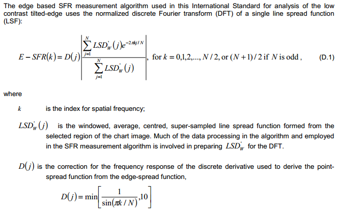
![slant_ideal_angle5.00_light200_dark_20]() Verification
Verification

To observe the effects of the LSF correction factor, we use an idealized edge, tilted 5 degrees, shown on the right. You can click on it to download it for your own testing.
The ideal edge increases uniformly from 0 to 1 over a distance of τ = 1 pixel.
|
The MTF of an ideal uniformly-increasing edge of width τ is the Fourier transform FT of its derivative, which is
If τ is the sampling rate (the same as Δx or a in the green box, above), The expected value of MTF at the Nyquist frequency (0.5 cycles/pixel) is |
 = \dfrac{u\left((t+\tau) / 2\right) - u\left((t-\tau) / 2\right)}{\tau}") for unit step function u.
for unit step function u. = \dfrac{\sin(\pi \tau f)}{\pi \tau f}")

 = \dfrac{\sin(\pi\tau f_{\textrm{Nyq}})}{\pi\tau f_{\textrm{Nyq}}} = \frac{\sin(\pi /2)}{\pi /2} = \dfrac{2}{\pi} = 0.6366")
Here are the results without and with the LSF correction factor. Note that gamma has been set to 1 because the idealized image is not gamma-encoded. The results with LSF correction are much closer to the expected value of 2/π = 0.6366. The difference is likely due to digital sampling and the numerical binning/oversampling process: the average oversampled edge shown in the figures below is slightly rounded. Also, the edge rotation correction that is not applied to edges slanted by less than 8 degrees. The edge rotation is not included in the ISO standard and so is not applied to edges that fall under the ISO standard algorithm.
 Ideal edge, uncorrected MTF. Ideal edge, uncorrected MTF.MTF@Nyquist = 0.56. |
 Ideal edge, LSF-corrected MTF. Ideal edge, LSF-corrected MTF.MTF@Nyquist = 0.624. |
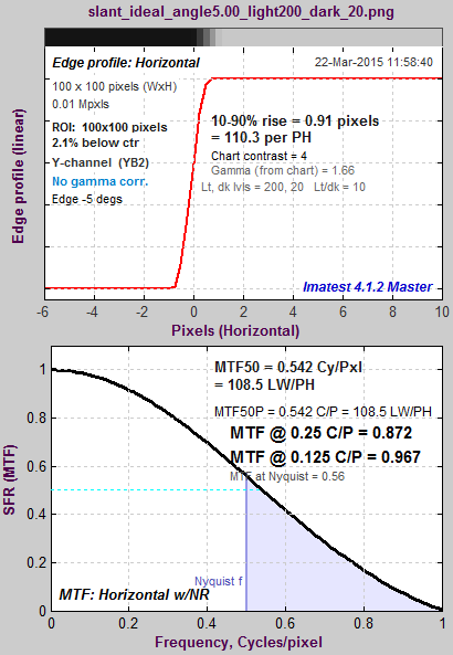
|
The figure on the right, generated by MTF Compare (a postprocessor to MTF calculation programs for comparing MTF calculations), compares the uncorrected MTF of the ideal edge (blue) with the corrected MTF (burgundy). The black line is the uncorrected/corrected transfer function = 1/(correction factor D). It has the expected values of 0.9 (1/1.1107) at the Nyquist frequency (f = 0.5 C/P) and 2/π = 0.6366 at 2*Nyquist (1 C/P). |
 MTF Compare Uncorrected vs. Corrected MTF Compare Uncorrected vs. Corrected |
Effects of gamma
Most color space files are gamma-encoded with gamma around 0.5, which is the default for Imatest slanted-edge SFR calculations. (Actual gamma varies considerably, and may be complicated by a tonal response curve on top of the gamma curve.) However, the ideal pulse is not gamma-encoded, so gamma = 1 is the appropriate setting. If gamma is set to 0.5 (the default), an inappropriate linearization will be applied to the edge, resulting in erroneous results: the MTF at 2*Nyquist is not equal to 0, as it should be. |
 Ideal edge, uncorrected MTF, calculated Ideal edge, uncorrected MTF, calculated(incorrectly) with gamma = 0.5 |
The idealized image has much more energy above the Nyquist frequency than typical high quality images. Here is an example for a high quality camera showing the effects of the LSF correction factor on MTF50— the most commonly-used summary metric.
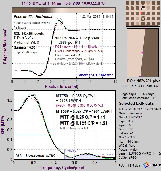 Typical edge, uncorrected MTF. Typical edge, uncorrected MTF.MTF50 = 0.355 Cycles/Pixel. |
 Typical edge, LSF-corrected MTF. Typical edge, LSF-corrected MTF.MTF50 = 0.360 C/P: 1.41% higher. |
The difference may not be significant for many applications.
Consistency with older Imatest versions
The new correction factor is available in Imatest 4.1.2+, where it is turned off by default. The correction factor is turned on by default in Imatest 4.2+ releases.
You can override the default, i.e., turn the correction factor on or off, by clicking Settings (in the Imatest main window), Options III, and checking or unchecking the Use LSF… checkbox as appropriate. Once the setting is saved, it will be retained across all future versions unless changed by the user. The default calculation be selected unless you manually change it in Options III window.
We strongly recommend turning on the LSF correction factor, i.e., the box should be checked.
For industrial testing with pass/fail thresholds set up with the old calculation, we recommend either:
- adjusting your pass/fail specification to account for the measurement change
- continuing to use the old calculation by setting devCorr = 0 in the [imatest] section of the ini file
For example, on an ideal edge MTF at Nyquist/4 (0.125 C/P, a common KPI) is only increased by 0.64%, at Nyquist/2 (0.250 C/P) MTF is increased by 2.80%. On an actual sharp, RAW camera-phone image with Gamma=1, the MTF at Nyquist/4 is increased by 0.81%, MTF at Nyquist/4 is increased by 3.00%.
↧
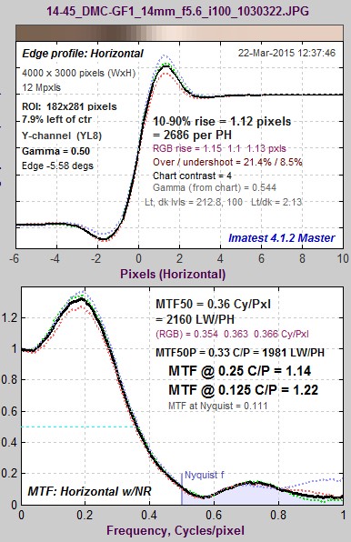
Measuring Multiburst pattern MTF with Stepchart
Measuring MTF is not a typical application for Stepchart— certainly not its primary function— but it can be useful with multiburst patterns, which are a legacy from analog imaging that occasionally appear in the digital world. The multiburst pattern is not one of Imatest’s preferred methods for measuring MTF: see the MTF Measurement Matrix for a concise list. But sometimes customers need to analyze them. This feature is available starting with Imatest 4.1.3 (March 2015).
Here is a crop of a multiburst pattern, generated by a Tektronix device:
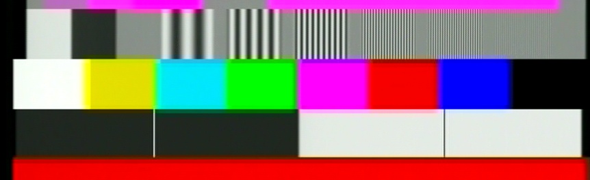
Crop of Multiburst pattern: click on image for full-size pattern that you can download.
Running Stepchart with the multiburst pattern
Open Stepchart, then read the multiburst image. Make a rough region selection for the multiburst pattern— it will be refined as shown below. Then press Yes (not Express mode) to bring up the Stepchart settings window.
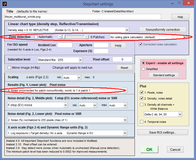 Stepchart settings for Multiburst MTF measurement
The key settings are circled in red. Automatic (Zone detection) should be unchecked and 6 patches should be selected using the slider (for this pattern; some multiburst patterns have as few as 5 zones). Under Results (Fig. 1, Lower plot), select 4. Noise uncorrected for patch nonuniformity, norml. to 1 in patch 1. Only Plot 1. Pixels, noise is relevant to the multiburst image. When settings are complete, click OK. If this is the first run for this size of image, the fine ROI adjustment window will appear.
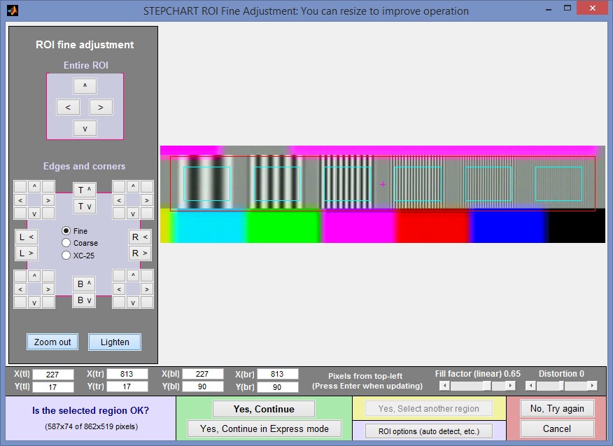 Fine ROI adjustment window for Multiburst pattern in Stepchart. May be enlarged.
Results
The standard deviation of the pixels in the patch, which is normally used to measure noise, is proportional to the MTF of the pattern in the patch (as long as it’s above the noise). To obtain an accurate result the patch nonuniformity correction is turned off (by setting Results (Fig. 1, Lower plot) to 4. Noise uncorrected…, as indicated above.
The key results are in the first Stepchart figure, most importantly in the lower plot, which contains the MTF for the patches.
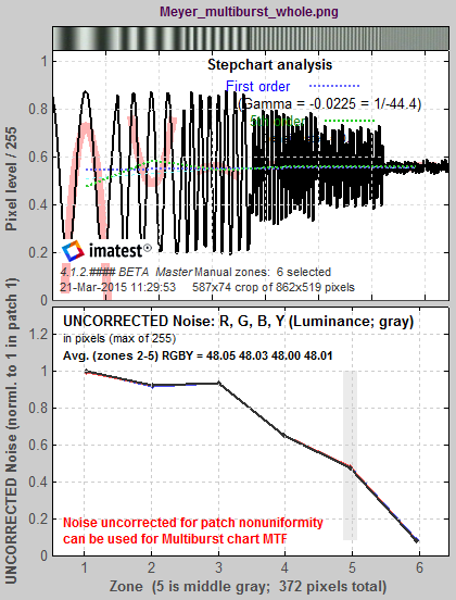 Stepchart Multiburst results: MTF is in lower plot
|
There are several ways we could enhance this calculation, but we will only do them if their is sufficient interest.
|
↧
↧
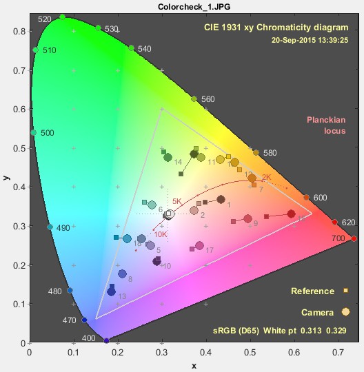
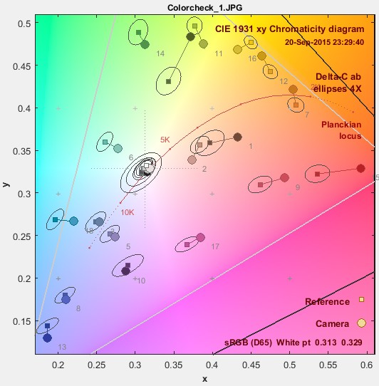
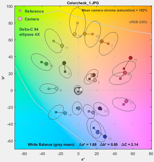
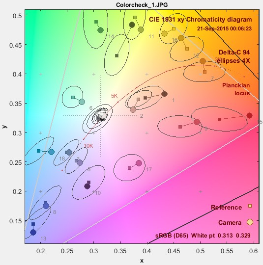
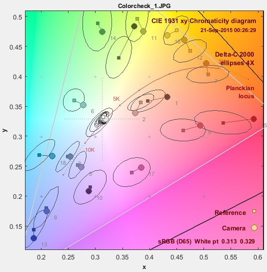
Color difference ellipses
Imatest has several two-dimensional displays for comparing test chart reference (ideal) colors with measured (camera) colors, where reference colors are represented by squares and measured values are represented by circles. The two most familiar representations— CIELAB a*b* and CIE 1931 xy chromaticity— are shown below. They are for the Colorchecker image, also shown below, where the upper-left of each patch is the reference color and the lower-right is the camera color.
 |
 |
| How different are the reference and camera colors in the Colorchecker image on the right, represented in these diagrams? |  |
Color differences and MacAdam ellipses
When these representations are viewed, the question naturally arises, “how different are the reference and camera colors?” Color differences can be quantified by several measurements— ΔEab, ΔE94, and ΔE00 (where 00 is short for 2000), where ΔE measurements include chroma (color) and luminance (brightness). If brightness (L*) is omitted, these measurements are called ΔCab, ΔC94, and ΔC00, where C stands for chroma (which includes a color’s hue and saturation). In this post we will discuss chroma differences. ΔCab = (a*2+b*2)1/2 (sometimes called ΔC) is the simple Euclidean (geometric) distance on the a*b* plane. It’s familiar but not accurate.
Starting with Imatest 4.2, Imatest’s two-dimensional chroma displays— CIELAB a*b*, CIE 1931 xy chromaticity, CIE u’v’ chromaticity, Vectorscope, and CbCr— can display ellipses that assist in visualizing perceptual color differences.
These ellipses were developed from the MacAdam ellipses, shown on the right.
MacAdam ellipses shown in the
CIE 1931chromaticity diagram,
magnified 10X (from Wikipedia)
The MacAdam ellipses were developed from a set of experiments performed at the University of Rochester in 1942, in which an observer tried to match pairs of colors, one fixed and one variable. The ellipse parameters are based on statistical variations in the matching, which are closely related to Just Noticeable Differences (JND). Twenty-five colors (whose xy values are shown as • in the illustration) were used.
Almost all images of MacAdam ellipses show the ellipses for the original 25 colors. In imatest we use a sophisticated interpolation routine to determine the ellipse parameters for color test charts. This is quite reliable since the gamut of the original color set extends well beyond the gamut of the widely-used sRGB color space (the standard of Windows and the internet), as well as most other color spaces used in imaging. At least 10 of the original colors are outside the sRGB gamut. sRGB is used for all examples in this post.
The ellipses are a visual indicator of the magnitude of perceived color (chroma) difference. The longer the ellipse axis, the greater the distance on the a*b* plane for a given color difference.
Here are the MacAdam ellipses for the X-Rite Colorchecker, in xy (from xyY) and u’v’ (from Lu’v’) representations, displayed in Multicharts. u’v’ is supposed to be more perceptually uniform than xy, and that is not evident inside the sRGB gamut. This may be one reason why u’v’ hasn’t gained much traction in the imaging industry.
 xy Colorchecker MacAdam ellipses, magnified 10X |
 xy Colorchecker MacAdam ellipses, magnified 10X |
The MacAdam ellipses are not widely used in imaging (though they seem to have traction in LED lighting). Instead, color differences based on CIELAB (L*a*b*) color space, which was developed in 1976 with the intent of being much more perceptually uniform than xyY, are used. Color differences are usually presented as ΔEab, ΔE94, or ΔE00. In all ΔE (color difference) equations, the Luminance (L*) term can be easily removed, leaving chroma differences ΔC, which can be displayed in in two dimensions.
Color difference ellipses in Imatest
All Imatest modules that can produce two-dimensional color different plots can display color difference ellipses. Colorcheck, SFRplus, and eSFR ISO display them in the a*b* plot. Multicharts and Multitest display them in a*b*, xy, u’v’, Vectorscope, and CbCr plots. In addition to MacAdam ellipses, which are not generally used for color difference measurements (but are interesting for comparison), the following color difference metrics are presented. The illustrations below are for a Colorchecker (shown above) analyzed in Multicharts.
ΔCab (plain ΔC – 1976)
ΔCab is simple geometric distance in the a*b* plane of CIELAB (L*a*b*) color space. When CIELAB was designed, the intent was that ΔC = 1 would correspond to one Just Noticeable Difference (JND). This may hold for colors with very low chroma (a*2+b*2)1/2, but it fails badly as chroma increases, which is why ΔE94 and ΔE00 were developed. ΔEab and ΔCab are familiar and often mentioned in imaging literature, but they should never be used for important measurements.
 a*b* Colorchecker ΔCab ellipses (circles!), magnified 4X |
 xy Colorchecker ΔCab ellipses, magnified 4X, zoomed in |
ΔC ellipses are always show magnified 4X (10X would be too large for clear display). We show the xy plot zoomed in so more detail is visible.
ΔC94 (ΔC 1994)
ΔE94 was developed to compensate for the deficiencies of ΔEab. Circles become ellipses with their major axes aligned with the radius from the origin (a* = b* = 0). It is more more accurate than ΔEab, especially for strongly chromatic colors.
 a*b* Colorchecker ΔC94 ellipses, a*b* Colorchecker ΔC94 ellipses,magnified 4X |
 xy Colorchecker ΔC94 ellipses, magnified 4X, zoomed in |
ΔC00 (ΔC 2000)
ΔE00 was developed as a further refinement over ΔE94. It has an extremely complex equation. Though not perfect, it’s the best of the current color difference formulas, and is recommend when color differences need to be quantified. It’s quite close to ΔE94, except for some blue colors. Until we added these ellipses to Imatest, there was no convenient way to visually compare the different ΔE measurements!
 a*b* Colorchecker ΔC00 ellipses, a*b* Colorchecker ΔC00 ellipses,magnified 4X |
 xy Colorchecker ΔC00 ellipses, xy Colorchecker ΔC00 ellipses,magnified 4X, zoomed in |
Displaying the ellipses in Imatest
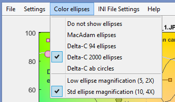
In Imatest 4.2 the ellipses are not displayed by default. We may change this in a later version. The table below shows how to control ellipse display.
| Multicharts Multitest |
Multicharts and Multitest share ini file settings. Ellipse settings for both are set in the Color ellipses dropdown menu in Multicharts. Standard ellipse magnification (10x for MacAdam ellipses, 4X for Delta-C ellipses) is recommended. |
 |
| Colorcheck | The selection is in the middle-left of the Colorcheck settings window. | 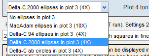 |
| SFRplus eSFR ISO |
In (Rescharts) SFRplus and eSFR ISO, ellipse settings are located in the Ellipses dropdown menu, displayed to the right of the bottom of the a*b* plot, when it is selected. |  |
↧
Measuring temporal noise
Temporal noise is random noise that varies independently from image to image, in contrast to fixed-pattern noise, which remains consistent (but may be difficult to measure because it is usually much weaker than temporal noise). It can be analyzed by Colorcheck and Stepchart and was added to Multicharts and Multitest in Imatest 5.1.
It can be calculated by two methods.
- the difference between two identical test chart images (the Imatest recommended method), and
- the ISO 15739-based method, which where it is calculated from the pixel difference between the average of N identical images (N ≥ 8) and each individual image.
In this post we compare the two methods and show why method 1 is preferred.
(1) Two file difference method. In any of the modules, read two images. The window shown on the right appears. Select the Read two files for measuring temporal noise radio button.
The two files will be read and their difference (which cancels fixed pattern noise) is taken. Since these images are independent, noise powers add. For indendent images I1 and I2, temporal noise is
\(\displaystyle \sigma_{temporal} = \frac{\sigma(I_1 – I_2)}{\sqrt{2}}\)
In Multicharts and Multitest temporal noise is displayed as dotted lines in Noise analysis plots 1-3 (simple noise, S/N, and SNR (dB)).
(2) Multiple file method. From ISO 15739, sections 6.2.4, 6.2.5, and Appendix A.1.4. Available in Multicharts and Multitest. Currently we are using simple noise (not yet scene-referred noise). Select between 4 and 16 files. In the multi-image file list window (shown above) select Read n files for temporal noise. Temporal noise is calculated for each pixel j using
\(\displaystyle \sigma_{diff}(j) = \sqrt{ \frac{1}{N} \sum_{i=1}^N (X_{j,i} – X_{AVG,j})^2} = \sqrt{ \frac{1}{N} \sum_{i=1}^N X_{j,i}^2 – \left(\frac{1}{N} \sum_{i=1}^N X_{j,i}\right)^2 } \)
The latter expression is used in the actual calculation since only two arrays, \(\sum X_{j,i} \text{ and } \sum X_{j,i}^2 \), need to be saved. Since N is a relatively small number (between 4 and 16, with 8 recommended), it must be corrected using formulas for sample standard deviation from Identities and mathematical properties in the Wikipedia standard deviation page as well as Equation (13) from ISO 15739. \(s(X) = \sqrt{\frac{N}{N-1}} \sqrt{E[(X – E(X))^2]}\).
\(\sigma_{temporal} = \sigma_{diff} \sqrt{\frac{N}{N-1}} \)
We currently recommend the difference method (1) because our experience so far has shown no advantage to method (2), which requires many more images (N ≥ 8 recommended), but allows fixed pattern noise to be calculated at the same time.
To calculate temporal noise with either method, read the appropriate number of files (2 or 4-16) then push the appropriate radio button on the multi-image settings box.
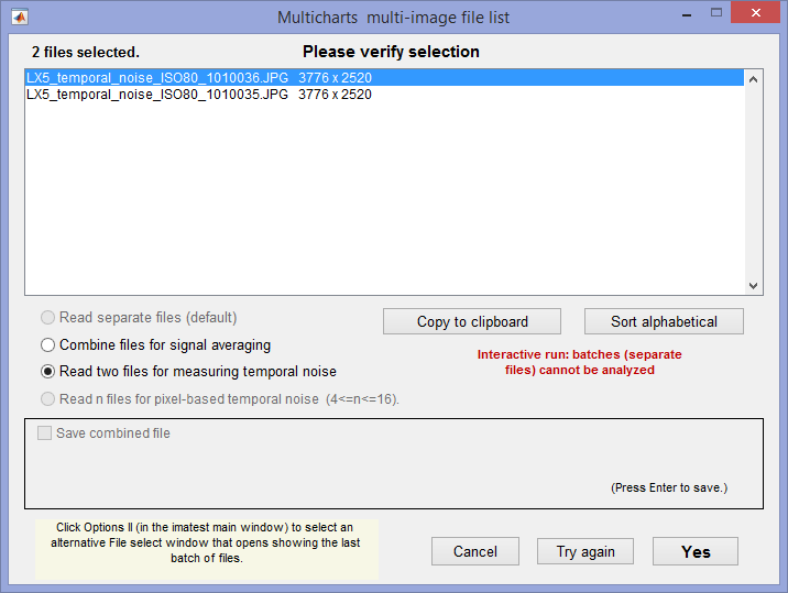 Multi-image settings window, showing setting for method 1.
if 4-16 images are enterred, the setting for method 2 (Read n files…) will be available.
Results for the two methods
The two methods were compared using identical Colorchecker images taken on a Panasonic Lumix LX5 camera (a moderately high quality small-sensor camera now several years old).
Difference method (1) (two files)
Here are the Multicharts results for 2 files.
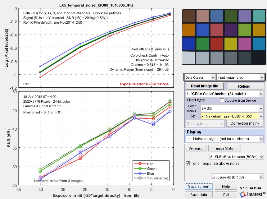 Multicharts SNR results for temporal noise, shown as thin dotted lines in the lower plot
Multi-file method (2) (4-16 files)
|
Here are results (SNR (dB)) for runs with 4, 8, and 16 files. For 4 files, temporal SNR (thin dotted lines) is slightly better than standard noise. Temporal SNR is slightly lower for 8 files and very slightly lower for 16 files. For 8 and 16 files results are closer to the results for 2 files (though differences between 8 and 16 files are very small). The bottom line: We recommend the two-file (difference) method because it is accurate and relatively fast. The multi file method is slower for acquiring and analyzing images— at least 8 images are recommended, so why bother? |
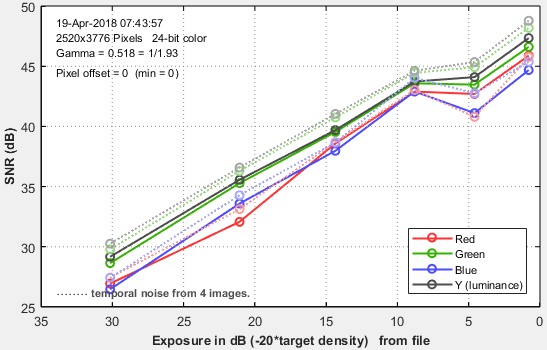 Temporal SNR from 4 images Temporal SNR from 4 images |
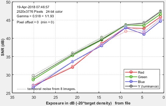 Temporal SNR from 8 images Temporal SNR from 8 images |
|
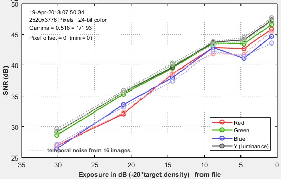 Tempoal SNR from 16 images Tempoal SNR from 16 images |
↧
Correcting nonuniformity in slanted-edge MTF measurements
Slanted-edge regions can often have non-uniformity across them. This could be caused by uneven illumination, lens falloff, and photoresponse nonuniformity (PRNU) of the sensor.
Uncorrected nonuniformity in a slanted-edge region of interest can lead to an irregularity in MTF at low spatial frequencies. This disrupts the low-frequency reference which used to normalize the MTF curve. If the direction of the nonuniformity goes against the slanted edge transition from light to dark, MTF increases. If the nonuniformity goes in the same direction as the transition from light to dark, MTF decreases.
To demonstrate this effect, we start with a simulated uniform slanted edge with some blur applied.

Then we apply a simulated nonuniformity to the edge at different angles relative to the edge. This is modeled to match a severe case of nonuniformity reported by one of our customers:

Here is the MTF obtained from the nonuniform slanted edges:

If the nonuniformity includes an angular component that is parallel to the edge, this adds a sawtooth pattern to the spatial domain, which manifests as high-frequency spikes in the frequency domain. This is caused by the binning algorithm which projects brighter or darker parts of the ROI into alternating bins.
Compensating for the effects of nonuniformity
Although every effort should be made to achieve even illumination, it’s not always possible (for example, in medical endoscopes and wide-FoV lenses).
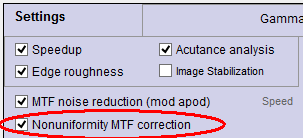 Imatest 4.5+ has an option for dealing with this problem for all slanted-edge modules (SFR and Rescharts/fixed modules SFRplus, eSFR ISO, SFRreg, and Checkerboard). It is applied by checking the “Nonuniformity MTF correction” checkbox in the settings (or “More” settings) window, shown on the right.
When this box is checked, a portion of the spatial curve on the light side of the transition (displayed on the right in Imatest) is used to estimate the nonuniformity. The light side is chosen because it has a much better Signal-to-Noise Ratio than the dark side. In the above image, this would be the portion of the the edge profile more than about 6 pixels from the center. Imatest finds the first-order fit to the curve in this region, limits the fit so it doesn’t drop below zero, then divides the average edge by the first-order fit.
The applied compensation flattens the response across the edge function and significantly improves the stability of the MTF:
Summary
For this example, Imatest’s nonuniformity correction reduces our example’s -26.0% to +22.8% change in MTF down to a -3.5% to +4.7% change. This is an 83% reduction in the effect of the worst cases of nonuniformity.
 MTF50 versus nonuniformity angle without [blue] and with [orange] nonuniformity correction
While this is a large improvement, the residual effects of nonuniformity remain undesirable. Because of this, we recommend turning on your ISP’s nonuniformity correction before performing edge-SFR tests or averaging the MTF obtained from nearby slanted edges with opposite transition directions relative to the nonuniformity to reduce the effects of nonuniformity on your MTF measurements further.
Detailed algorithm
We assume that the illumination of the chart in the Region of Interest (ROI) approximates a first-order function, L(d) = k1 + k2d, where d is the horizontal or vertical distance nearly perpendicular to the (slanted) edge. The procedure consists of estimating k1 and k2, then dividing the linearized average edge by L(d).
k1 and k2, are estimated using the light side of the transition starting at a sufficient distance dN from the transition center xcenter, so the transition itself does not have much effect on the k1 and k2 estimate. To find dN we first find the 20% width d20 of the line spread function (LSF; the derivative of the edge), i.e., the distance between the points where the LSF falls to 20% of its maximum value.
dN = xcenter + 2 d20
If the edge response for x > dN has a sufficient number of points, it is used to calculate k1 and k2 using standard polynomial fitting techniques. The result is a more accurate representation of the edge with the effects of nonuniformity reduced.
Future work
- Consider the 2D nonuniformity across the ROI before sampling the 1D average edge
- Use an image of a flat-field to perform nonuniformity correction within Imatest
- Consider the impact of noise which was not included in this study
- Incorporate enhancements to the slanted-edge algorithms into future revisions of ISO 12233
For any questions on how to do this, or how we can help you with your projects, contact us at support@imatest.com.
↧
Making Dynamic Range measurements robust against flare light
Introduction
A camera’s Dynamic Range (DR) is the range of tones in a scene that can be reproduced with adequate contrast and good Signal-to-Noise Ratio (SNR). Camera Dynamic Range is often limited by flare light, which is stray light in the image, primarily caused by reflections between lens elements. Flare light reduces DR by fogging images, i.e., washing out detail in dark areas. It is the primary reason that the Dynamic Range of cameras (which include lenses) is poorer than that of image sensors, which can be up to 150dB (30 million:1) for recent HDR (High Dynamic Range) sensors.
In the past two years we’ve learned that flare light in test chart images could, in theory, be mistaken for the image of the test chart, resulting in exaggerated Dynamic Range measurements. The situation became real in mid-2019, when we started seeing actual images where this happened. By studying these images we have developed techniques to guard against exaggerated SNR measurements caused by flare light. We describe these techniques here.
We recognize that some customers may actually prefer exaggerated measurements because they yield very high Dynamic Range numbers— sometimes over 120dB, which approach the specifications of HDR sensors, and look good in marketing materials. The reduced (but realistic) DR measurements obtained when the effects of flare light are removed, may make some of these customers uncomfortable. We will do our best to deal with their objections.
The effects of flare light
Flare light can be illustrated with an image of the XYLA chart— a precision HDR test chart with a linear configuration, consisting of 21 grayscale patches with Optical Density steps of 0.3. The image is from a low-cost “black box” camera.
The upper cross-section plot, made with the Image Statistics module, is taken at the center of the XYLA image. Flare is most obvious in the image and as a decay in the cross-section plot to the left of the brightest patch.
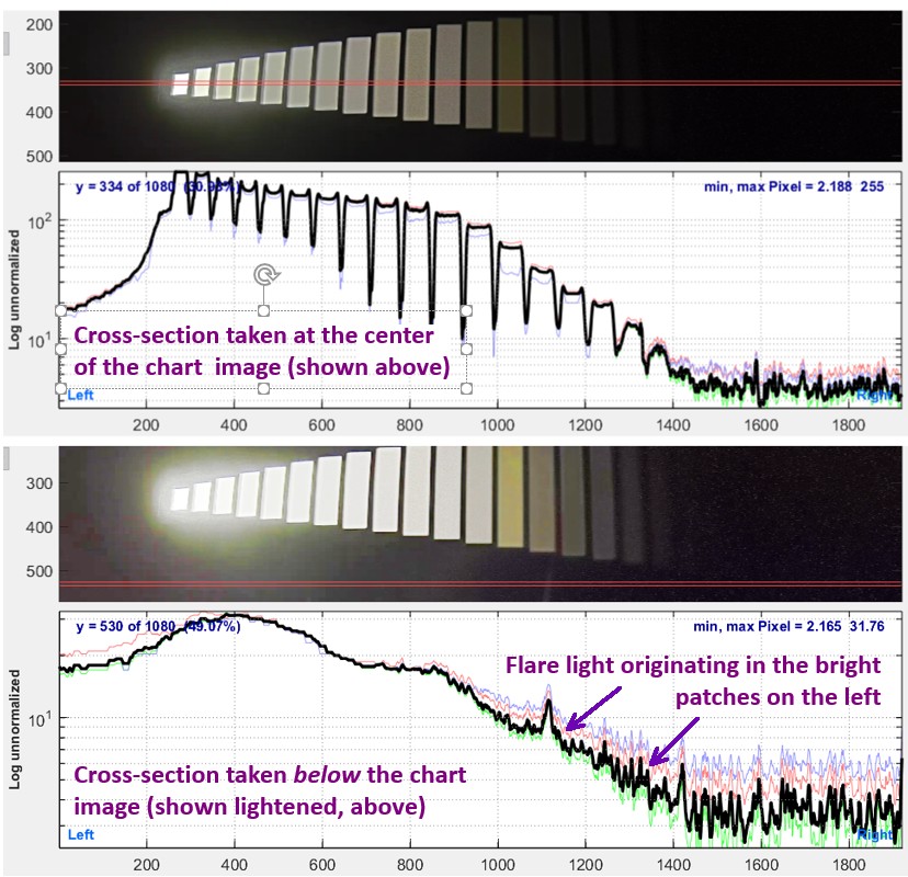 XYLA image (from the same image; the lower is lightened) and corresponding cross-section plots
The lower cross-section was taken outside (below) the active chart image, which is shown lightened above to make flare light more visible. The variation in pixel level on the right side of the chart (x between 800 and 1600) is caused by flare light diffusing from the brightest patches on the left.
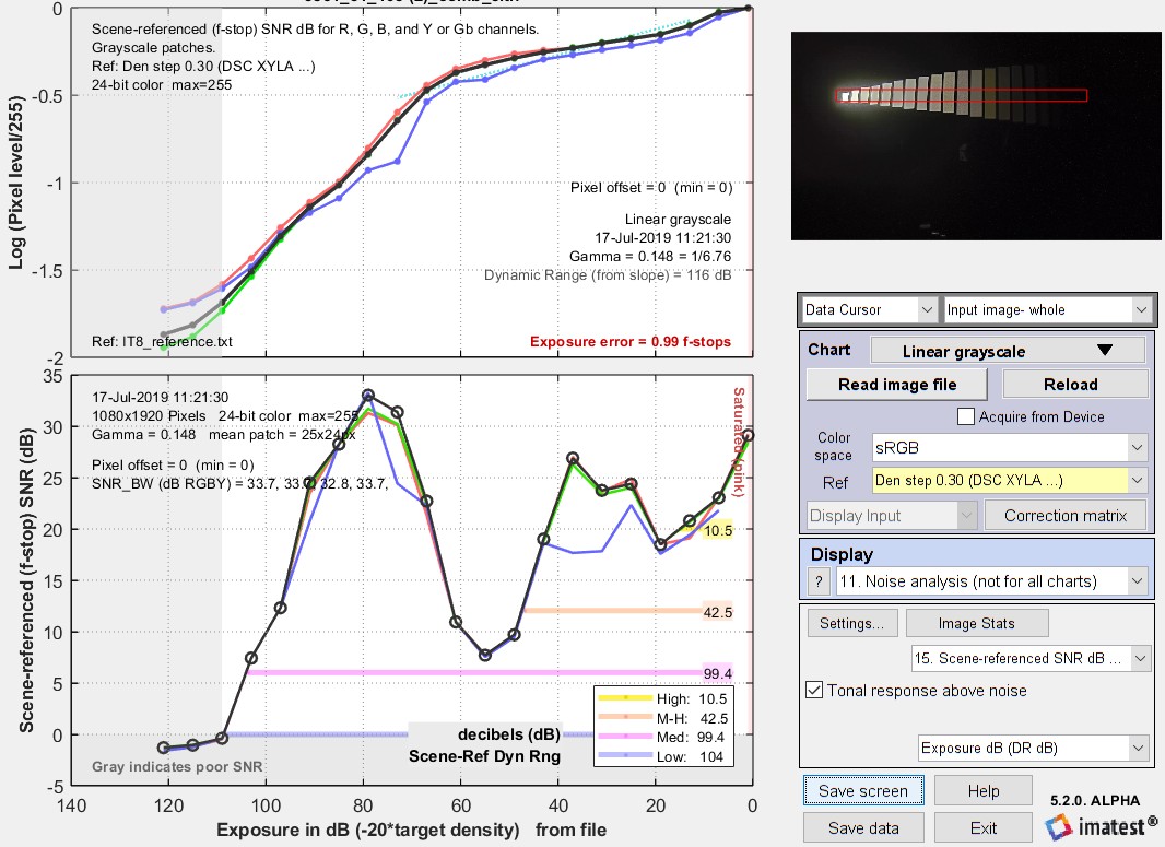 Results of the XYLA image (above) showing strong tone mapping. Click on the image to view full-sized. Some notes on this image. This image has very strong local tone-mapping, leading to an exceptionally low (and not very meaningful) measured gamma of 0.148.The SNR varies in an unusual way: it doesn’t drop monotonically, as it would for a conventional linear image sensor. This indicates that an HDR (High Dynamic Range) image sensor with several operating regions was used. Because the image had significant barrel distortion, region selection was difficult. The Contrast Resolution chart is much easier to use and provides a better indication of system performance in the presence of tone mapping. |
If the flare light were any worse it could easily have been mistaken for a signal from the chart itself, leading to an false Dynamic Range measurement.
Flare light can be extremely complex. It can add an offset to the image (often called “veiling glare”), which is difficult to distinguish from a black level offset in the image processing pipeline. Most of the time it is largest near bright patches, then decreases with distance from these patches. The rate of decrease is rarely a well-behaved exponential.
|
Lens reflections are a major cause of medium-range flare light. An uncoated glass surface (index of refraction ≅ 1.5) reflects R = 4% = 0.04 of the light incident on it. (Remember, a sheet of glass or a lens component has two surfaces.)
According to Edmund Optics, the best anti-reflective coatings have R ≅ 0.4% = 0.004 over the visible spectrum (~400-700nm). R = 0.005 may be more realistic for a reasonable range of incident angles. The light reflected back to the sensor from each secondary reflection would be R2 = 0.000025 = 2.5*10-5 = -92 dB (20*log10(R2)). The number of secondary reflections Nsec increases rapidly with the number of components M (groups of elements cemented together, each of which has two air-to-glass surfaces) in a lens: 1 for 1 component; 6 for 2 components; 15 for 3 components; 28 for 4 components; 45 for 5 components, etc. For M components, \(\displaystyle \text{Number of secondary reflections} = N_{sec} = \sum_{i=1}^{2M-1}i = 2M(2M-1)/2 = M(2M-1))\) M = 5 components are typical for high quality camera phones; M ≥12 components is commonplace for DSLR zoom lenses. Overall lens flare is less severe than the number of secondary reflections suggests because the stray light don’t cover the whole image. It decreases with distance from bright regions. It’s easy to see why practical camera Dynamic Range measurements are limited to around 70-90dB, even when sensor Dynamic Range is much higher. 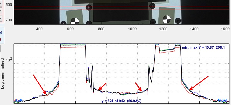
Image Statistics cross-section of a Contrast Resolution image for an inferior camera, showing spatially-varying flare indicated by red arrows Because the ISO 18844 flare model does not measure the spatially-dependent flare caused by lens reflections, it has limited value in characterizing practical system performance. |
| Key takeaways— Flare light is predominantly light in dark regions of the image that diffuses from bright regions. This diffused light can be confused with the actual chart signal (especially with linear charts), resulting in exaggerated (overly optimistic) Dynamic Range measurements. Moreover, increasing flare light (which could result from poorer, i.e., cheaper, lens coatings) decreases the actual DR by fogging shadow areas of the image, but can lead to increased DR measurements. Hence the need to distinguish artifact signals from flare light from real signals from the chart. |
Circular test charts
UHDR photographic film chart
The test charts recommended by Imatest for measuring Dynamic Range are transmissive (i.e., backlit) charts with (approximately) circular patch configurations, i.e., they are not linear (like the XYLA chart, shown above). The two or three-layer High Dynamic Range chart, shown on the right, comes in several versions. Because photographic film charts can’t be manufactured with consistent patch densities, a reference file is required when these charts are used.
High quality cameras
Until recently, most of the DR images we analyzed came from DSLR or mirrorless cameras that had relatively low flare light. The recent images we’ve seen with severe flare light are from inferior cameras. We haven’t figured out exactly why the flare light is so much worse: it might be inferior coatings in the multi-element lenses or less baffling in the barrel of the lens.
Here are examples of results from high quality cameras. Click on the thumbnails below to view full-sized images.


The four images are for 48-bit RAW (or TIFF derived from RAW) and 24-bit JPEG files captured on the Sony A7Rii camera with two very different lenses:
- A consumer grade Canon EF 75-300mm f/4-5.6 lens (original version) set to 80mm, f/5.6. This lens has 15 elements in 10 groups.
- The very high quality Canon TS-E 90mm f/2.8 (Tilt/Shift) lens set to f/5.6. Since this lens has 6 elements in 5 groups, it would be expected to have lower flare light than the 75-300.
- Note that results from the two darkest patches, 35 and 36, are outside the plot because their densities (8.184 and 8.747, equivalent to 163.7 and 174.5dB) are beyond the 160 dB limit of the plot. 160dB is equivalent to a 100 million:1 ratio— far beyond the capabilities of any camera system with a lens in front of the sensor.
As expected, the 90mm T/S lens has significantly better DR, and the JPEG files had more of a response “shoulder” (an area of reduced slope in the lighter part of the image). But there is one surprise. The Dynamic Range of the JPEG images is comparable to the raw images— apparently because gamma encoding, which decreases the number of pixel levels in bright regions and increases it in dark regions, extends DR beyond what would be expected for a linear 8-bit (256 level) file.
Note that in three of the four images above, the Low Quality dynamic range is lower than the Dynamic Range from slope, and in the remaining image they are very close. We don’t recommend the use of slope-based DR by itself (because it often extends well beyond the region where SNR = 0dB (Signal/Noise = 1), i.e., it includes regions where poor SNR causes noise to completely mask image detail.
Low-cost “black box” camera
The differences between the DR of the two lenses (medium and high quality) seems to be minor when compared to an image from a low-cost “black box” camera we recently received.
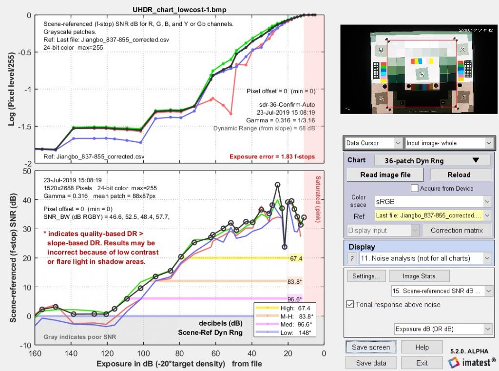
Dynamic Range results for low-cost “black box” camera
The Low Quality (SNR = 0dB, labeled Low ——— ) Dynamic Range is measured as 148dB— an astonishingly high number. But the Dynamic Range from slope is 66dB— much lower than several quality-based DR measurements (and lower than the slope-based DR for the 90mm T/S lens). Note that the two darkest patches don’t appear on this plot because their densities (8.184 and 8.747) are beyond the 160dB limit of the plot. (160dB is a range of 100 million to 1: more than expected from any sensor or camera— or to put it another way, if one photon were to reach the darkest patch, the lightest patch would set the chart or sensor on fire).
To understand what is happening, we need to observe the dark portions of the images from high quality cameras, shown extra (X-) or XX-lightened to make detail visible in the darker patches, and compare them to a comparable region in the low-cost camera.

The RAW image for the 6-element (5 group) 90mm lens shows distinct regions of decreasing brightness in the 7th row (2nd from the bottom; patches 27-32), and still shows distinct regions in the bottom row, though brightness no longer decreases. A reflection (possibly from the lens) is visible in patch 30. The JPEG image from the 90mm lens has more noise. Some may be quantization noise since the JPEG has only 256 levels (0-255). The images from the 15 element (10 group) 75-300mm lens definitely show more evidence of flare.
Now, compare these results— especially for the RAW image from the 90mm T/S lens (left thumbnail)— with the image from the low-cost “black box” camera.
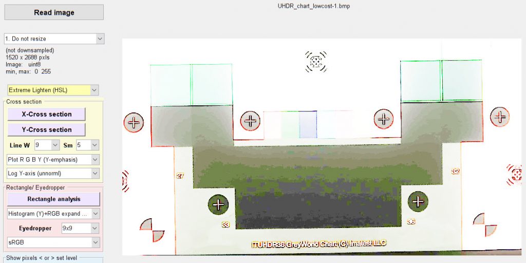
Dark areas of JPEG image from low cost “black box” camera, X-lightened
No patch detail is visible in the bottom two rows (patches 27-36). Instead of decreasing from left to right in each row, the pixel level decreases from top to bottom, remaining relatively constant across the bottom two rows, with banding (the result of 255 levels) clearly visible. This is clearly flare light, not signal from the test chart. Unfortunately the Signal-to-Noise ratio in these rows is quite good because Imatest removes the effects of illumination nonuniformity in noise calculations. (A setting can turn this off, but we generally recommend leaving it on to give better results in the presence of actual illumination nonuniformity). But this signal is an artifact, not the real thing.
This leads us to the inescapable conclusion that the quality-based Dynamic Range results for the low-cost “black box” camera are incorrect, and that we need to detect the patches where flare light overwhelms the signal from the chart image and exclude them from the DR calculation.
Fortunately this is not difficult for Dynamic Range test charts with a circular configuration, such as the 36-patch DR chart illustrated above. (It’s harder for linear charts). Because of the patch arrangement, the patch level stops decreasing when flare light dominates the scene. This is clearly visible in the bottom two rows in the above example, where the image gets darker from top to bottom in these rows— perpendicular to the patch sequence. When the patch brightness ceases to decrease, we can be confident that flare light dominates, i.e., we are outside the Camera Dynamic Range. This is the case for patches beyond the slope-based Dynamic Range.
For this reason it makes sense to limit all quality-based Dynamic Range measurements to the slope-based DR (maximum).
 In Imatest 5.2, the Options II window (accessed from the button at the lower-right of the Imatest main window) offers a choice of whether or not to limit quality-based Dynamic range to slope-based DR. When the box is checked the limit appears in the results display.
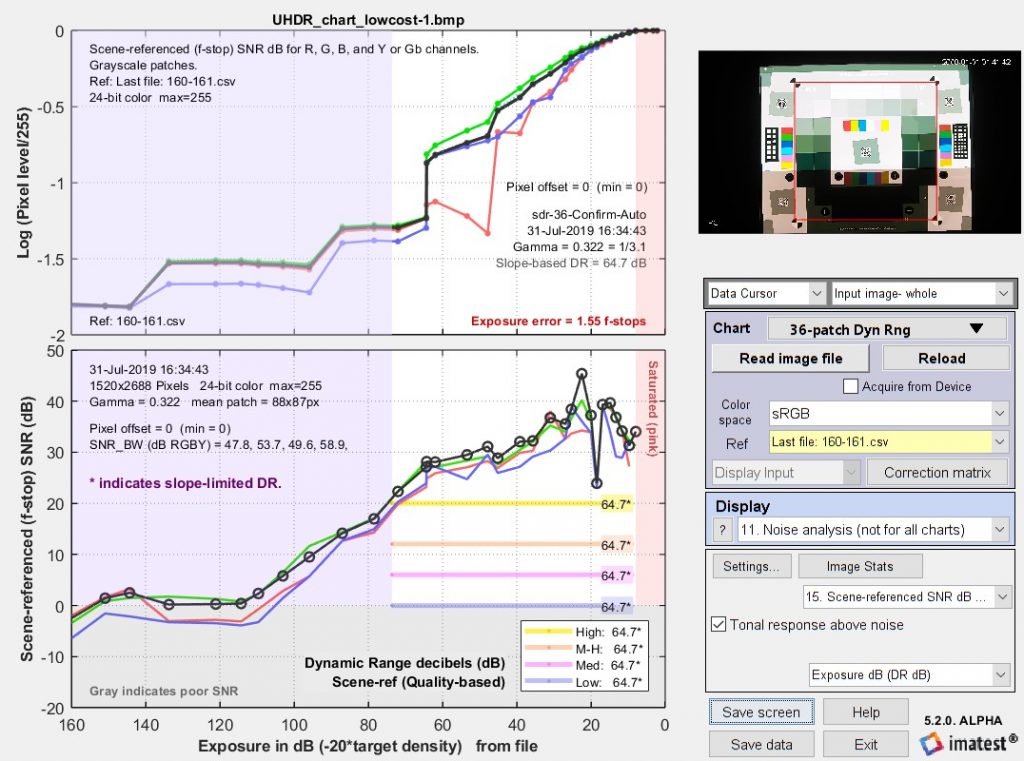
Dynamic Range results for low-cost “black box” camera, with Quality-based Dynamic Range limited by Slope-based DR
|
Key takeaways— Flare light wasn’t an issue with the high quality DSLR/Mirrrorless lenses we tested in the past, but it has become a major factor limiting the performance of recent low-cost lenses intended for the automotive or security industries. We have seen examples of how flare light can improve traditional Dynamic Range measurements while degrading actual camera DR. Our approach to resolving this issue is to limit quality-based Dynamic Range measurements (the range of densities where SNR ≥ 20dB for high quality through SNR ≥ 0dB for low quality) to the slope-based DR. This works because, for patches beyond the slope-based limit (where the slope of log pixel level vs. log exposure drops below 0.075 of the maximum slope),
Limiting Quality-based DR in this way significantly improves measurement accuracy, and perhaps more importantly, can help prevent inferior, low-quality lenses being accepted for applications critical to automotive safety or security. |
↧
↧
SFRreg: SFR from Registration Marks
Imatest SFRreg performs highly automated measurements of sharpness (expressed as Spatial Frequency Response (SFR), also known as Modulation Transfer Function (MTF)) and Lateral Chromatic Aberration from images that contain registration mark patterns (circles with two light and two dark quadrants). Unlike standard test charts, these patterns do not need to be located on a flat (planar) surface. Depending on the image source, they offer two advantages. You can
|
 Registration mark Registration mark |
Details of the regions to be analyzed are based on user-entered criteria (similar to SFRplus or eSFR ISO, which it closely resembles).
Sharpness is derived from light/dark slanted edges inside the registration marks, as described in Sharpness: What is it and how is it measured? SFRreg can handle a wide range of camera aspect ratios and chart arrangements.
SFRreg operates in two modes.
- Interactive/setup mode allows you to select settings and interactively examine results in detail. Saved settings are used for Auto Mode.
- Auto mode runs automatically with no additional user input. ROIs are located automatically based on settings saved from the interactive/setup mode. This allows images of different sizes and framing to be analyzed with no change of settings. Auto mode works with large batches of files, and is especially useful for automated testing, where framing may vary from image to image.
Part 1 of the instructions introduces SFRreg and explains how to obtain and photograph the chart. Part 2 shows how to run SFRreg inside Rescharts and how to save settings for automated runs. Part 3 illustrates the results.
SFRreg images from the Optikos Meridian projection systemImatest SFRreg is originally designed designed to work with images from the Optikos Meridian system, which consists of several projectors that project registration mark patterns towards a camera. These patterns appear at infinity focus at the camera. A typical image is shown below. |
 |
 Image acquired from a 9-projector Optikos Meridian system
SFRreg images from arbitrary arrays of printed registration mark charts
SFRreg also works with printed registration mark patterns, which can be placed anywhere in the image. For extreme wide-angle (fisheye) lenses they should be oriented facing directly towards the camera. Here is a synthesized image (we’ll add a real one soon). You can add other charts— typically color or grayscale— to the image for additional measurements.
 Fisheye lens image with synthesized registration mark charts oriented facing the camera
| Options | Notes | |
|---|---|---|
| Media | Inkjet (reflective), LVT film (transmissive) |
Inkjet (reflective) is usually the most practical choice. |
| Contrast |
4:1, 10:1 |
4:1 contrast is specified in the new ISO 12233:2014 standard. |
| Surface | Matte or semigloss | Semigloss is slightly sharper, but is more susceptible to glare (specular reflections), especially with wide angle lenses. Matte surface is recommended for wide angle lenses or difficult lighting situations. |
Slanted-edge algorithm The algorithms for calculating MTF/SFR were adapted from a Matlab program, sfrmat, written by Peter Burns ( ) to implement the ISO 12233:2000 standard. Imatest SFR, SFRplus, SFRreg, and eSFR ISO incorporates numerous improvements, including improved edge detection, better handling of lens distortion, a nicer interface, and far more detailed output. The original Matlab code is available on http://losburns.com/imaging/software/SFRedge/index.htm. In comparing sfrmat results with Imatest, note that if no OECF (tonal response curve) file is entered into sfrmat, no tonal response curve is assumed, i.e., gamma = 1 (linear response). Since the default value of gamma in Imatest is 0.5, which is typical of digital cameras, you must set gamma to 1 to obtain good agreement with sfrmat. ) to implement the ISO 12233:2000 standard. Imatest SFR, SFRplus, SFRreg, and eSFR ISO incorporates numerous improvements, including improved edge detection, better handling of lens distortion, a nicer interface, and far more detailed output. The original Matlab code is available on http://losburns.com/imaging/software/SFRedge/index.htm. In comparing sfrmat results with Imatest, note that if no OECF (tonal response curve) file is entered into sfrmat, no tonal response curve is assumed, i.e., gamma = 1 (linear response). Since the default value of gamma in Imatest is 0.5, which is typical of digital cameras, you must set gamma to 1 to obtain good agreement with sfrmat. |
Obtaining and photographing the charts
Registration Mark charts can be purchased from the Imatest store in a variety of inkjet media (reflective and transmissive) (Other media will be available on request.) Although we recommend that you purchase the charts, they can be printed on photographic-quality inkjet printers, but you must have fine materials, skill, and a knowledge of color management.
SFRreg results
When calculations are complete, results are displayed in the Rescharts window, which allows a number of displays to be selected. The following table shows where specific results are displayed. Results plots are very similar to SFRplus and eSFR ISO. We show two samples of results below.
 SFRreg display selections
| Measurement | Display |
| MTF (sharpness) for individual regions | 1. Edge and MTF |
| MTF (sharpness) for entire image | 4. Multi-ROI summary 12. 3D plot 13. Lens-style MTF plot |
| Lateral Chromatic Aberration | 2. Chromatic Aberration |
| Original image showing region selection | 8. Image & geometry |
| EXIF data | 7. Summary & EXIF data |
| Acutance/SQF (Subjective Quality Factor) | 3. SQF / Acutance |
| Edge roughness | 14. Edge roughness |
| Chromatic Aberration (radial) | 15. Radial (Chr Aber, etc.) |
Multi-ROI summary display
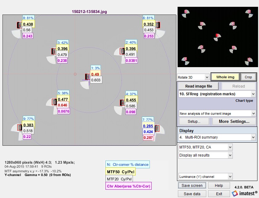 SFRreg results in Rescharts window: Multiple region (ROI) summary
(Only upper Vertical regions have been selected to keep the view uncluttered.)
The multi-ROI (multiple Region of Interest) summary shown in the Rescharts window (above) contains a detailed summary of SFRreg results. (3D plots also contain an excellent summary.) The upper left contains the image in muted gray tones, with the selected regions surrounded by red rectangles and displayed with full contrast. Up to four results boxes are displayed next to each region. The results are selected the the Display options area on the right of the window, below the Display selection.
|
The Results selection (right) lets you choose which results to display. N is region number. Ctr-corner distance % is the approximate location of the region. CA is Chromatic Aberration in area, as percentage of the center-to-corner distance (a perceptual measurement). A legend below the image shows which results are displayed. The View selection (far right) lets you select how many results boxes to display, which can be helpful when many regions overlap. From top to bottom the number of boxes is 4, 3, 2, 2, and 1, respectively. |
 Results selection |
 View selection View selection |
Edge and MTF display
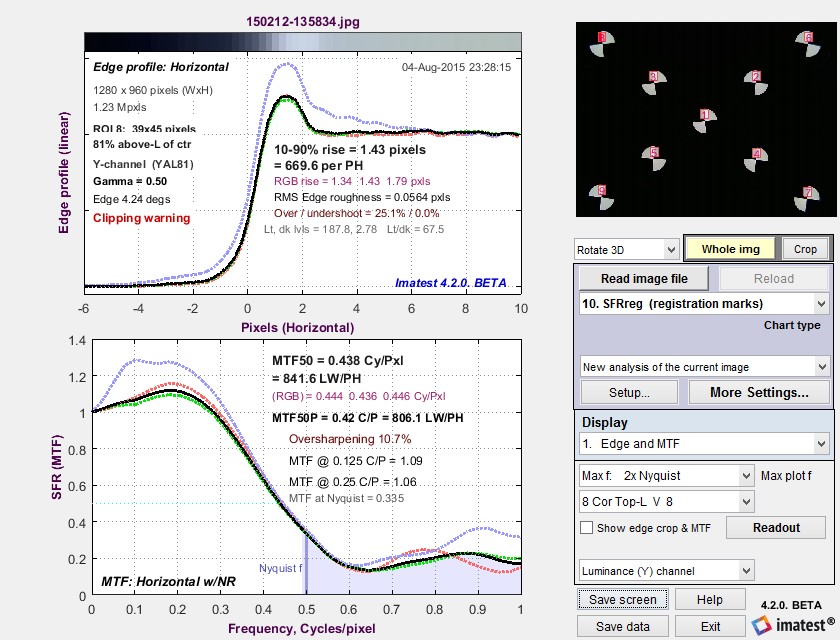 Edge and MTF display in Rescharts window
Diffraction-limited MTF and edge response are shown as a pale brown dotted lines
when pixel spacing (5.7um for the EOS-40D) has been entered.
This display is identical to the SFR Edge and MTF display. The edge (or line spread function) is plotted on the top and the MTF is plotted on the bottom. The edge may be displayed linearized and normalized (the default; shown), unlinearized (pixel level) and normalized, or linearized and unnormalized (good for checking for saturation, especially in images with poor white balance). Edge display is selected by pressing .
There are a number of readouts, including 10-90% rise distance, MTF50, MTF50P (the spatial frequency where MTF is 50% of the peak value, differing from MTF50 only for oversharpened pulses), the secondary readouts (MTF @ 0.125 and 0.25 C/P in this case), and the MTF at the Nyquist frequency (0.5 cycles/pixel). The diffraction-limited MTF curve (not shown above) is displayed as a pale brown dotted line when pixel pitch is entered.
MTF is explained in Sharpness: What is it and how is it measured? MTF curves and Image appearance contains several examples illustrating the correlation between MTF curves and perceived sharpness.
How to Read MTF Curves by H. H. Nasse of Carl Zeiss. Excellent, thorough introduction. 33 pages long; requires patience. Has a lot of detail on the MTF curves similar to the Lens-style MTF curve in SFRplus. Even more detail in Part II. Their (optical) MTF Tester K8 is of some interest.
Understanding MTF from Luminous Landscape.com has a much shorter introduction.
Understanding image sharpness and MTF A multi-part series by the author of Imatest, mostly written prior to Imatest’s founding. Moderately technical.
Bob Atkins has an excellent introduction to MTF and SQF. SQF (subjective quality factor) is a measure of perceived print sharpness that incorporates the contrast sensitivity function (CSF) of the human eye. It will be added to Imatest Master in late October 2006.
Optikos makes instruments for measuring lens MTF. Their site has some interesting articles, for example, Lens Testing: The Measurement of MTF (Modulation Transfer Function).
↧
Real-time focusing with Imatest direct data acquisition
Speed up your testing with real-time focusing in Imatest Version 2020.2.
Recent speed improvements allow for real-time focusing and allow users to analyze images from two types of sources:
- Direct image acquisition from a variety of devices, listed in detail in Supported image acquisition hardware for Imatest Master.
- Image files listed in Image file formats and acquisition devices,
Although the majority of images traditionally analyzed by Imatest have been from files (JPG, PNG, etc.), three modules, which can perform a majority of Imatest’s analyses, support direct data acquisition, and can be used for realtime analysis.
- Rescharts, which analyzes a variety of sharpness/MTF charts: slanted-edge charts with automatic or manual detection, Siemens Star, Log Frequency Contrast, Spilled Coins (Dead Leaves), or any arbitrary image (which produces uncalibrated relative sharpness measurements). Depending on the chart, measurements may include lateral chromatic aberration, optical distortion, and tonal response (OECF). Noise, SNR (Signal-to-Noise Ratio), and color response are available with eSFR ISO.
- Color/Tone Interactive, which analyzes all widely-used color and grayscale charts (as well as a good many custom or obscure charts). Measurements include tonal response, color accuracy, noise, and SNR,
- Uniformity Interactive, which analyzes flat field images for vignetting (light falloff), color nonuniformity, noise, SNR, and PRNU (photo response nonuniformity) and DSNU (dark signal nonuniformity).
While all measurements have been sped up by a factor of 4 to 10 or more compared with 2020.1, focusing is the most important and most speed critical function. If it’s done at all, it needs to be fast.
The following video, made using an inexpensive 2MP USB camera selected with the Device Manager and run in Rescharts, illustrates real-time focusing using slanted edges from an eSFR ISO test chart.
Direct data acquisition works as shown in the illustration below. 1. Acquire the image. 2. Analyze. 3 Display. Then repeat until Stop reload is pressed.
Here are the key settings for direct data acquisition with real-time updates.
- Run Device Manager to select the device to analyze, the device resolution, and to prepare the image using the Preview function.
- Open one of the three modules that support image acquisition: Rescharts, Color/Tone Interactive, or Uniformity Interactive. Note that SFRplus Setup, eSFR ISO setup, SFRreg Setup, and Checkerboard Setup all run Rescharts.
- In the Settings dropdown menu, set (check) Auto reload. (The setting will be saved; you won’t need to repeat this.)
- Acquire the image.
- Select the display you want to see reloaded, then press Reload.
- The Reload button will change color to Yellow and indicate the number of reloads followed by “Stop reload“. Press Stop reload when you are finished.
↧
Three optical centers
Customers frequently want to know how we measure the optical center of the image (not to be confused with the geometrical center). They may be surprised that we measure three, shown below in the 2D contour map, which is one of the options in Rescharts slanted-edge modules 3D & contour plots.
 SFRplus contour plot for MTF50P, showing three optical centers:

For a normal well-constructed lens, the optical centers are all close to the geometric center of the image. They can diverge for defective or poorly-constructed lenses.
Center of MTF (Center of Sharpness)
The center of MTF (or Sharpness) is the approximate location of maximum MTF, based on a second-order fit to results for slanted-edge charts (SFRplus, eSFR ISO, Checkerboard, and SFRreg). It is displayed (along with the two other optical centers) displayed in the 2D image contour map, which is one of the options in 3D & Contour plots.
Algorithm: Starting with an array of all MTF50 values and arrays for the x and y-locations of each value (the center of the regions), fit the MTF50 value to a second-order curve (a parabola). For the x (horizontal) direction,
MTF = axx2 + bxx + cx .
The peak location for this parabola, i.e., the
x-Center of MTF = xpeak = –bx /(2ax) .
It is reported if it’s inside the image. (It is not uncommon for it to be outside the image for tilted or defective lenses.) The y-center is calculated in exactly the same way.
MTF asymmetry is calculated from the same data and parabola fits as the Center of MTF. For the x- direction,
MTF50 (x-aysmmetry) = (MTFfit(R) − MTFfit(L)) / (MTFfit(R) + MTFfit(L))
where MTFfit(R) and MTFfit(L) are the parabola fits to MTF at the left and right borders of the image, respectively. MTF50 (y-asymmetry) is calculated with the same method.
Center of illumination
The center of illumination is the brightest location in the image. It is usually not distinct, since brightness typically falls off very slowly from the peak location. It only represents the lens for very even back-illumination (we recommend one of our uniform light sources or an integrating sphere). For front illumination (reflective charts) it represents the complete system, including the lighting.
It is calculated very differently in Uniformity and Uniformity Interactive than it is in the slanted-edge modules.
Algorithm for Uniformity and Uniformity Interactive: The location of the peak pixel (even if it’s smoothed) is not used because the result would be overly sensitive to noise. Find all points where the luminance channel g(x,y) (typically 0.2125*R + 0.7154*G + 0.0721*B) is above 95% of the maximum value. The x-center of illumination is the centroid of these values. The y-center is similar. This calculation is much more stable and robust than using peak values.
Cx = ∫x g(x)dx / ∫g(x)dx
Algorithm for Rescharts slanted-edge modules: Starting with Imatest 2020.2, the mean ROI level of each region is calculated and can be plotted in 3D & contour plots.
 SFRplus contour plot for mean ROI levels, used to calculate
Center of Illumination (⊗)
The calculation is identical to the Center of MTF calculation (above), except that mean ROI level is used instead of MTF50.
Center of distortion
The center of distortion is the point around which Imatest distortion models assume that distortion is radially symmetric. It is calculated in Checkerboard, SFRplus, and Distortion (the older legacy module) when a checkbox for calculating it is checked. It is calculated using nonlinear optimization. If it’s not checked (or the center is not calculated), the geometrical center of the image is assumed to be the center of distortion.
Distortion measurements are described in Distortion: Methods and Modules.
Link
What is the center of the image? by R.G. Wilson and S. A. Shafer. Fifteen, count ’em fifteen optical centers. Do I hear a bid for sixteen? Going… going…
↧
Comparing sharpness in different cameras
Introduction – Spatial frequency units – Summary metrics – Sharpening
Example – Summary
Introduction: The question
We frequently receive questions that go something like,
“How can you compare the sharpness of images taken with different cameras that have different resolutions (total pixel count) and physical pixel size (pitch or spacing)?”
The quick answer is that it depends on the application.
- Are you interested in the sharpness of the image over the whole sensor (typical of nearly all pictorial photography— landscape, family, pets, etc.)? We call these images image-centric.
- Do you need to measure details of specific objects (typical for medical imaging, machine vision, parts inspection, aerial reconnaissance, etc.)? We call these images object-centric.
In other words, what exactly do you want to measure?
The keys to appropriate comparison of different images are
- the selection of spatial frequency units for MTF/SFR (sharpness) measurements, and
- the selection of an appropriate summary metric (important since the most popular metric, MTF50, rewards software sharpening too strongly).
The table below is adapted from Sharpness – What is it, and how is it measured? We strongly recommend reviewing this page if you’re new to sharpness measurements.
| MTF Unit | Application | Equation |
|
Cycles/Pixel (C/P) |
Pixel-level measurement. Nyquist frequency fNyq is always 0.5 C/P. For comparing how well pixels are utilized. Not an indicator of overall image sharpness. |
|
|
Cycles/Distance (cycles/mm or cycles/inch) |
Cycles per physical distance on the sensor. Pixel spacing or pitch must be entered. Popular for comparing resolution in the old days of standard film formats (e.g., 24x36mm for 35mm film). For comparing Imatest results with output of lens design programs, which typically use cycles/mm. |
\(\frac{MTF(C/P)}{\text{pixel pitch}}\) |
|
Line Widths/Picture Height (LW/PH) |
Measure overall image sharpness. Line Widths is traditional for TV measurements. LW/PH and LP/PH are the best units for comparing the overall sharpness (on the image sensor) of cameras with different sensor sizes and pixel counts. Image-centric. |
\(2 \times MTF\bigl(\frac{LP}{PH}\bigr)\) ; \(2 \times MTF\bigl(\frac{C}{P}\bigr) \times PH\) |
|
Line Pairs/Picture Height (LP/PH) |
\(MTF\bigl(\frac{LW}{PH}\bigr) / 2\) ; \(MTF\bigl(\frac{C}{P}\bigr) \times PH\) |
|
|
Cycles/Angle: Cycles/milliradian |
Angular frequencies. Pixel spacing (pitch) must be entered. Focal length (FL) in mm is usually included in EXIF data in commercial image files. If it isn’t available it must be entered manually, typically in the EXIF parameters region at the bottom of the settings window. If pixel spacing or focal length is missing, units will default to Cycles/Pixel. Cycles/Angle (degrees or milliradians) is useful for comparing the ability of cameras to capture objects at a distance. For example, for birding (what we called “birdwatching” with I was young and geeky) it is a good measure of a camera’s ability to capture an image of a bird at a long distance, independent of sensor and pixel size, etc. It is highly dependent on lens quality and focal length. Object-centric. |
\(0.001 \times MTF\bigl(\frac{\text{cycles}}{\text{mm}}\bigr) \times FL(\text{mm})\) \(\frac{\pi}{180} \times MTF\bigl(\frac{\text{cycles}}{\text{mm}}\bigr) \times FL(\text{mm})\) FL can be estimated from the simple lens equation, 1/FL=1/s1+1/s2, where s1 is the lens-to-chart distance, s2 is the lens-to-sensor distance, and magnification M=s2/s1. FL=s1/(1+1/|M|) = s2/(1+|M|) This equation may not give an accurate value of M because lenses can deviate significantly from the simple lens equation. |
|
Cycles/object distance: Cycles/object mm |
Cycles per distance on the object being photographed (what many people think of as the subject). Pixel spacing and magnification must be entered. Important when the system specification references the object being photographed. Cycles/distance is useful for machine vision tasks, for example, where a surface is being inspected for fine cracks, and cracks of a certain width need to be detected. Object-centric. |
\(MTF\bigl( \frac{\text{Cycles}}{\text{Distance}} \bigr) \times |\text{Magnification}|\) |
|
Line Widths/Crop Height |
Primarily used for testing when the active chart height (rather than the total image height) is significant. Not recommended for comparisons because the measurement is dependent on the (ROI) crop height. |
|
|
Line Widths/Feature Height (Px) (formerly Line Widths or Line Pairs/N Pixels (PH)) |
When either of these is selected, a Feature Ht pixels box appears to the right of the MTF plot units (sometimes used for Magnification) that lets you enter a feature height in pixels, which could be the height of a monitor under test, a test chart, or the active field of view in an image that has an inactive area. The feature height in pixels must be measured individually in each camera image. Example below. Useful for comparing the resolution of specific objects for cameras with different image or pixel sizes. Object-centric. |
\(2 \times MTF\bigl(\frac{C}{P}\bigr) \times \text{Feature Height}\) \(MTF\bigl(\frac{C}{P}\bigr) \times \text{Feature Height}\) |
|
PH = Picture Height in pixels. FL(mm) = Lens focal length in mm. Pixel pitch = distance per pixel on the sensor = 1/(pixels per distance). |
||
| Summary Metric | Description | Comments |
| MTF50 MTFnn |
Spatial frequency where MTF is 50% (nn%) of the low (0) frequency MTF. MTF50 (nn = 50) is widely used because it corresponds to bandwidth (the half-power frequency) in electrical engineering. | The most common summary metric; correlates well with perceived sharpness. Increases with increasing software sharpening; may be misleading because it “rewards” excessive sharpening, which results in visible and possibly annoying “halos” at edges. |
| MTF50P MTFnnP |
Spatial frequency where MTF is 50% (nn%) of the peak MTF. | Identical to MTF50 for low to moderate software sharpening, but lower than MTF50 when there is a software sharpening peak (maximum MTF > 1). Much less sensitive to software sharpening than MTF50 (as shown in a paper we presented at Electronic Imaging 2020). All in all, a better metric. |
| MTF area normalized |
Area under an MTF curve (below the Nyquist frequency), normalized to its peak value (1 at f = 0 when there is little or no sharpening, but the peak may be » 1 for strong sharpening). | A particularly interesting new metric because it closely tracks MTF50 for little or no sharpening, but does not increase for strong oversharpening; i.e., it does not reward excessive sharpening. Still relatively unfamiliar. Described in Slanted-Edge MTF measurement consistency. |
| MTF10, MTF10P, MTF20, MTF20P |
Spatial frequencies where MTF is 10 or 20% of the zero frequency or peak MTF | These numbers are of interest because they are comparable to the “vanishing resolution” (Rayleigh limit). Noise can strongly affect results at the 10% levels or lower. MTF20 (or MTF20P) in Line Widths per Picture Height (LW/PH) is closest to analog TV Lines. Details on measuring monitor TV lines are found here. |
Although MTF50 (the spatial frequency where MTF falls to half its low frequency value) is the best known summary metric, we don’t recommend it because it rewards overly sharpened images too strongly. MTF50P is better in this regard, and MTF area normalized may be even better (though it’s not familiar or widely used). Summary metrics are described in Correcting Misleading Image Quality Measurements, which links to a paper we presented at Electronic Imaging 2020.
Sharpening: usually improves image appearance, but complicates camera comparisons
Sharpening, which is applied after image capture, either in the camera or in post-processing software, improves the visual appearance of images (unless it’s overdone), but makes camera comparisons difficult. It is described in detail here. Here are a few considerations.
 Sharpening varies tremendously from camera to camera. Images converted from raw using Imatest’s Read Raw, dcraw, or LibRaw are unsharpened. JPEG images from high quality consumer cameras typically have moderate amounts of sharpening, characterized by limited edge overshoot (visible as halos) and a small bump in the MTF response. But all bets are off with camera phones and other mobile devices. We have seen ridiculous amounts of sharpening— with huge halos and MTF response peaks, which may make images look good when viewed on tiny screens, but generally wrecks havoc with image quality.
Sharpening can be recognized by the shape of the edge and the MTF response. Unsharpened images have monotonically decreasing MTF. Camera B below is typical. Sharpened images, illustrated on the right (from Correcting Misleading Image Quality Measurements) have bumps or peaks on both the edge and and MTF response. The edge on the right could be characterized as strongly, but not excessively, sharpened.
Sharpening summary — Since different amounts of sharpening can make comparisons between images difficult, you should examine the Edge/MTF plot for visible signs of sharpening. If possible, sharpening should be similar on different cameras. If this isn’t possible, a careful choice of the summary metric may be beneficial. MTF50P or MTF Area Peak Normalized are recommended.
Example: A medical imaging system for measuring sharpness on objects of a specified size

Camera A
Here is an example using the Rezchecker chart, whose overall size is 1-7/8” high x 1-5/8” wide. (The exact size isn’t really relevant to comparisons between cameras.)
The customer wanted to compare two very different cameras to be used for a medical application that requires a high quality image of an object over a specified field of view, i.e., the application is object-centric.
A Rezchecker chart was photographed with each camera. Here are the images. These images can be analyzed in either the fixed SFR module (which can analyze MTF in multiple edges) or in Rescharts Slanted-edge SFR (which only works with single edges).

Camera B
Because we don’t know the pixel size of these cameras (it can be found in sensor spec sheets; it’s not usually in the EXIF data), we choose units Line Widths per Feature Height. When pixel size is known, line pairs per mm is preferred (it’s more standard and facilitates comparisons). Here is the settings window from Rescharts Slanted-edge SFR.
 Settings window
The optional Secondary Readouts (obscured by the dropdown menu) are MTF50P and MTF Area PkNorm (normalized to the peak value). Feature Height (114 pixels for camera A; 243 for camera B) has to be measured individually for each image: easy enough in any image editor (I drew a rectangle in the Imatest Image Statistics module and used the height). Entering the feature height for each image is somewhat inconvenient, which is why Cycles/Object mm is preferred (if the sensor pixel pitch is known).
Results of the comparison
The Regions of interest (ROIs) are smaller than optimum, especially for camera A, where the ROI was only 15×28 pixels: well below the recommended minimum. This definitely compromises measurement accuracy, but the measurement is still good enough for comparing the two cameras.
Since there is no obvious sharpening (recognized by “halos” near edges; a bump or peak in the MTF response), the standard summary metrics are equivalent. MTF50 only fails when there is strong sharpening.
For resolving detail in the Rezchecker, camera B wins. At MTF50P = 54.8 LW/Feature Height, it is 20% better than camera A, which had MTF50P = 45.8 LW/Feature Height. Details are in the Appendix, below.
Summary
|
To compare cameras with very different specifications (pixel size; pixel pitch; field of view, etc.) the image needs to be categorized by task. We define two very broad types of image
Sharpening must be taken into consideration: it complicates the comparison. Look carefully at the Edge/MTF plot for visible signs of sharpening. If possible, images should have similar amounts of sharpening. If it isn’t possible, MTF50P or MTF Area Peak Normalized are recommended summary metrics. |
Appendix: Edge/MTF results for cameras A and B

Camera A Edge/MTF results (Click on the image to view full-sized)

Camera B Edge/MTF results (Click on the image to view full-sized)
↧
↧
Gamma, Tonal Response Curve, and related concepts
Introduction – Encoding vs. Display gamma – Why logarithms? – Advantages of gamma curve
Expected gamma values – Gamma and MTF – Which patches are used to calculate gamma?
Why gamma ≅ 2.2? – Tone mapping – Logarithmic color spaces – Monitor gamma
Introduction
In this post we discuss a number of concepts related to tonal response and gamma that are scattered around the Imatest website, making them hard to find. We’re putting them together here in anticipation of questions about gamma and related concepts, which keep arising.
Gamma (γ) is the average slope of the function that relates the logarithm of pixel levels (in an image file) to the logarithm of exposure (in the scene).
\(\text{log(pixel level)} \approx \gamma \ \text{log(exposure)}\)
This relationship is called the Tonal Response Curve, (It’s also called the OECF = Opto-Electrical Conversion Function). The average is typically taken over a range of pixel levels from light to dark gray.
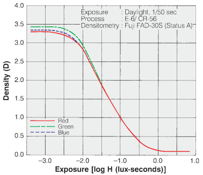
Tonal Response Curve for Fujichrome Provia 100F film. The y-axis is reversed from the digital plots.
Tonal Response Curves (TRCs) have been around since the nineteenth century, when they were developed by Hurter and Driffield— a brilliant accomplishment because they lacked modern equipment. They are widely used for film. The Tonal Response Curve for Fujichrome Provia 100F film is shown on the right. Note that the y-axis is reversed from the digital plot shown below, where log(normalized pixel level) corresponds to \(D_{base} – D\text{, where } D_{base} = \text{base density} \approx 0.1\).
Equivalently, gamma can be thought of as the exponent of the curve that relates pixel level to scene luminance.
\(\text{pixel level = (RAW pixel level)}^ \gamma \approx \text{exposure} ^ \gamma\)
There are actually two gammas: (1) encoding gamma, which relates scene luminance to image file pixel levels, and (2) display gamma, which relates image file pixel levels to display luminance. The above two equations (and most references to gamma on this page) refer to encoding gamma. The only exceptions are when display gamma is explicitly referenced, as in the Appendix on Monitor gamma.
The overall system contrast is the product of the encoding and decoding gammas. More generally, we think of gamma as contrast.
Encoding gamma is introduced in the image processing pipeline because the output of image sensors, which is linear for most standard (non-HDR) image sensors, is never gamma-encoded. Encoding gamma is typically measured from the tonal response curve, which can be obtained photographing a grayscale test chart and running Imatest’s Color/Tone module (or the legacy Stepchart and Colorcheck modules).
Display gamma is typically specified by the color space of the file. For the most common color space in Windows and the internet, sRGB, display gamma is approximately 2.2. (It actually consists of a linear segment followed by a gamma = 2.4 segment, which together approximate gamma = 2.2.) For virtually all computer systems, display gamma is set to correctly display images encoded in standard (gamma = 2.2) color spaces.
Here is an example of a tonal response curve for a typical consumer camera, measured with Imatest Color/Tone.
 Tonal response curve measured by the Imatest Color/Tone module
from the bottom row of the 24-patch Colorchecker,
Note that this curve is not a straight line. It’s slope is reduced on the right, for the brightest scene luminance. This area of reduced slope is called the “shoulder”. It improves the perceived quality of pictorial images (family snapshots, etc.) by reducing saturation or clipping (“burnout”) of highlights, thus making the response more “film-like”. A shoulder is plainly visible in the Fujichorme Provia 100D curve, above. Shoulders are almost universally applied in consumer cameras; they’re less common in medical or machine vision cameras.
Because the tonal response is not a straight line, gamma has to be derived from the average (mean) value of a portion of the tonal response curve.
Why use logarithms?
Logarithmic curves have been used to express the relationship between illumination and response since the nineteenth century because the eye’s response to light is logarithmic. This is a result of the Weber-Fechner law, which states that the perceived change dp to a change dS in an initial stimulus S is
\(dp = dS/S\)
Applying a little math to this curve, we arrive at \(p = k \ln(S/S_0)\) where ln is the natural logarithm (loge).
From G. Wyszecki & W. S. Stiles, “Color Science,” Wiley, 1982, pp. 567-570, the minimum light difference ΔL that can be perceived by the human eye is approximately
\(\Delta L / L = 0.01 = 1\% \). This number may be too stringent for real scenes, where ΔL/L may be closer to 2%.
What is gained by applying a gamma curve?
In photography, we often talk about zones (derived from Ansel Adams’ zone system). A zone is a range of illumination L that varies by a factor of two, i.e., if the lower and upper boundaries of a zone are L1 and L2, then L2 /L1 = 2 or log2(L2) – log2(L1) = 1. Each zone has equal visual weight, except for very dark zones where the differences are hard to see.
For a set of zones z = {0, 1, 2, 3, ..} the relative illumination at the boundaries between zones i and i+1 is 2–i = {1.0, 0.5, 0.25, 0.125, …}. The boundaries between relative pixel levels for encoding gamma γe are 2-iγe. For linear gamma, γe = 1, the relative pixel boundaries are Bpγ = {1, 0.5, 0.25, 0.125, …} (the same as L). For γe= 1/2.2 = 0.4545, they are Bpγ = {1.0000, 0.7297, 0.5325, 0.3886, 0.2836, 0.2069, 0.1510 ,0.1102, …}. The relative pixel boundaries Bpγ decrease much more slowly than for γe = 1.
The relative number of pixel levels in each zone is npγ(i) = Bpγ(i) – Bpγ(i+1). This leads to the heart of the issue. For a maximum pixel level of 2(bit depth)-1 = 255 for widely-used files with bit depth = 8 (24-bit color), the total number of pixels in each zone is Npγ(i) = 2(bit depth)npγ(i).
For a linear image (γe = 1), npγ(i) = {0.5, 0.25, 0.125, 0.0625, …}, i.e., half the pixel levels would be in the first zone, a quarter would be in the second zone, an eighth would be in the third zone, etc. For files with bit depth = 8, the zones starting from the brightest would have Npγ(i) = {128, 64, 32, 16, 8, 4, …} pixel levels. By the time you reached the 5th or 6th zone, the spacing between pixel levels would be small enough to cause significant “banding”, limiting the dynamic range.
For an image encoded with γe = 1/2.2 = 0.4545, the relative number of pixels in each zone would be npγ(i) = {0.2703, 0.1972, 0.1439, 0.1050, 0.0766, 0.0559, 0.0408, 0.0298, …}, and the total number Npγ(i) would be {69.2, 50.5, 36.8, 26.9, 19.6, 14.3, 10.4, 7.6, …}. The sixth zone, which has only 4 levels for γe = 1, has 14.3 levels, i.e., gamma-encoding greatly improves the effective dynamic range of images with limited bit depth by flattening the distribution of pixel levels in the zones.
What gamma (and Tonal Response Curve) should I expect?
And what is good?
JPEG images from consumer cameras typically have complex tonal response curves (with shoulders), with gamma (average slope) in the range of 0.45 to 0.6. This varies considerably for different manufacturers and models. The shoulder on the tonal response curve allows the the slope in the middle tones to be increased without worsening highlight saturation. This increases the apparent visual contrast, resulting in “snappier” more pleasing images.
RAW images from consumer cameras have to be decoded using LibRaw/dcraw. Their gamma depends on the Output gamma and Output color space settings (display gamma is shown in the settings window). Typical results are
- Encoding gamma ≅ 0.4545 with a straight line TRC (no shoulder) if conversion to a color space (usually sRGB or Adobe RGB) is selected;
- Encoding gamma ≅ 1.0 if a minimally processed image is selected.
RAW images from binary files (usually from development systems) have straight line gamma of 1.0, unless the Read Raw Gamma setting (which defaults to 1) is set to a different value.
Flare light can reduce measured gamma by fogging shadows, flattening the Tonal Response Curve for dark regions. Care should be taken to minimize flare light when measuring gamma.
That said, we often see values of gamma that differ significantly from the expected values of ≅0.45-0.6 (for color space images) or 1.0 (for raw images without gamma-encoding). It’s difficult to know why without a hands-on examination of the system. Perhaps the images are intended for special proprietary purposes (for example, for making low contrast documents more legible by increasing gamma); perhaps there is a software bug.
Gamma and MTF measurement
 MTF (Modulation Transfer Function, which is equivalent to Spatial Frequency Response), which is used to quantify image sharpness, is calculated assuming that the signal is linear. For this reason, gamma-encoded files must be linearized, i.e., the gamma encoding must be removed. The linearization doesn’t have to be perfect, i.e., it doesn’t have be the exact inverse of the tonal response curve. For most images (especially where the chart contrast is not too high), a reasonable estimate of gamma is sufficient for stable, reliable MTF measurements. The settings window for most MTF calculation has a box for entering gamma (or setting gamma to be calculated from the chart contrast).
Gamma is entered in the Setup or More settings window for each MTF module. They are described in the documentation for individual Rescharts modules. For Slanted-edge modules, they appear in the Setup window (crop shown on the right) and in the More settings window (crop shown below).

Gamma (input) defaults to 0.5, which is a reasonable approximation for color space files (sRGB, etc.), but is incorrect for raw files, where gamma ≅ 1. Where possible we recommend entering a measurement-based estimate of gamma.
Find gamma from grayscale patterns. Gamma is most frequently measured from grayscale patterns, which can be in separate charts or included in any of several sharpness charts— SFRplus, eSFR ISO, Star, Log F-Contrast, and Random. The grayscale pattern from the eSFR ISO and SFRplus chart is particularly interesting because it shows the levels of the light and dark portions of the slanted-edge patters used to measure MTF.
 Tonal response plot from eSFR ISO chart
Gamma = 0.588 here: close to the value (shown above) measured from the X-Rite Colorchecker for the same camera. The interesting thing about this plot is the pale horizontal bars, which represent the pixel levels of the light and dark portions of the selected slanted-edge ROIs (Regions of Interest). This lines let you see if the slanted-edge regions are saturating or clipping. This image shows that there will be no issue.
Select chart contrast and check Use for MTF. Only available for slanted-edge MTF modules. When Use for MTF is checked, the gamma (input) box is disabled.
This setting uses the measured of contrast of flat areas P1 and P2 (light and dark portions of the slanted-edge Regions of Interest (ROIs), away from the edge itself) to calculate the gamma for each edge. It is easy to use and quite robust. The only requirement is that the printed chart contrast ratio be known and entered. (It is 4:1 or 10:1 for nearly all Imatest slanted-edge charts.) This method is not reliable for chart contrasts higher than 10:1.
\(\displaystyle gamma\_encoding = \frac{\log(P_1/P_2)}{\log(\text{chart contrast ratio)}}\)
|
A brief history of chart contrast
This issue was finally corrected with ISO 12233:2014 (later revisions are relatively minor), which specifies a 4:1 edge contrast, which not only reduces the likelihood of clipping, but also makes the MTF calculation less sensitive to the value of gamma used for linearization. The old ISO 12233:2000 chart is still widely used: we don’t recommend it.
Imatest chrome-on-glass (CoG) charts have a 10:1 contrast ratio: the lowest that can be manufactured with CoG technology. Most other CoG charts have very high contrast (1000:1, and not well-controlled). We don’t recommend them. We can produce custom CoG charts quickly if needed. |
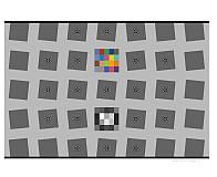
Which patches are used to calculate gamma?
This is an important question because gamma is not a “hard” measurement. Unless the Tonal Response Curve says pretty close to a straight line log pixel level vs. log exposure curve, its measured value depends on which measurement patches are chosen. Also, there have been infrequent minor adjustments to the patches used for Imatest gamma calculations— enough so customers occasionally ask about tiny discrepancies they find.
For the 24-patch Colorchecker, patches 2-5 in the bottom row are used (patches 20-23 in the chart as a whole).
For all other charts analyzed by Color/Tone or Stepchart, the luminance Yi for each patch i (typically 0.2125×R + 0.7154×G + 0.0721×B) is found, and the minimum value Ymin, maximum value Ymax, and range Yrange = Ymax – Ymin is calculated. Gamma is calculated from patches where Ymin + 0.2×Yrange < Yi < Ymax – 0.1×Yrange . This ensures that light through dark gray patches are included and that saturated patches are excluded.
History: where did gamma ≅ 2.2 come from?
It came from the Cathode Ray Tubes (CRTs) that were universally used for television and video display before modern flat screens became universal. In CRTs, screen brightness was proportional to the control grid voltage raised to the 2 to 2.5 power. For this reason, signals had to be encoded with the approximate inverse of this value, and this encoding stuck. As we describe above, in “What is gained by applying a gamma curve?”, there is a real advantage to gamma encoding in image files with a limited bit depth, especially 8-bit files, which only have 256 possible pixel levels (0-255).
Tone mapping
Tone mapping is a form of nonuniform image processing that lightens large dark areas of images to make features more visible. It reduces global contrast (measured over large areas) while maintaining local contrast (measured over small areas) so that High Dynamic Range (HDR) images can be rendered on displays with limited dynamic range.
Tone mapping can seriously mess up gamma and Dynamic Range measurements, especially with standard grayscale charts. The Contrast Resolution chart was designed to give good results (for the visibility of small objects) in the presence of tone mapping, which is becoming increasingly popular with HDR images.
Logarithmic color spaces
Logarithmic color spaces, which have a similar intent to gamma color spaces, are widely used in cinema cameras. According to Wikipedia’s Log Profile page, every camera manufacturer has its own flavor of logarithmic color space. Since they are rarely, if ever, used for still cameras, Imatest does little with them apart from calculating the log slope (n1, below). A detailed encoding equation from renderstory.com/log-color-in-depth is \(f(x) = n_1 \log(r_1 n_3+ 1) + n_2\).
From context, this can be expressed as
\(\text{pixel level} = n_1 \log(\text{exposure} \times n_3+ 1) + n_2\)
Since log(0) = -∞, exposure must be greater than 1/n3 for this equation to be valid, i.e., there is a minimum exposure value (that defines a maximum dynamic range).
By comparison, the comparable equation for gamma color spaces is
\(\log(\text{pixel level}) = \gamma \log(\text{exposure}) + n_2\) .
The primary difference is that pixel level instead of log(pixel level) is used the equation. The only thing Imatest currently does with logarithmic color spaces is to display the log slope n1, shown in the above tonal response curve plot. It could do more on customer request.
Appendix I: Monitor gamma
Monitors are not linear devices. They are designed so that Brightness is proportional to pixel level raised to the gamma power, i.e., \(\text{Brightness = (Pixel level)}^{\gamma\_display}\).
For most monitors, gamma should be close to 2.2, which is the display gamma of the most common color spaces, sRGB (the Windows and internet standard) and Adobe RGB.
|
To view the gamma chart correctly, right-click on it, copy it, then paste it into Fast Stone Image Viewer. This worked well for me on my fussy system where the main laptop monitor and my ASUS monitor (used for these tests) have different scale factors (125% and 100%, respectively). The gamma will be the value on the scale where the gray area of the chart has an even visual density. For the (blurred) example on the left, gamma = 2. Although a full monitor calibration (which requires a spectrophotometer) is recommended for serious imaging work, good results can be obtained by adjusting the monitor gamma to the correct value. We won’t discuss the process in detail, except to note that we have had good luck with Windows systems using QuickGamma. |
 Gamma chart. Best viewed with Fast Stone image viewer. |

Appendix II: Tonal response, gamma, and related quantities
For completeness, we’ve updated and kept this table from elsewhere on the (challenging to navigate) Imatest website.
| Parameter | Definition | ||||
| Tonal response curve | The pixel response of a camera as a function of exposure. Usually expressed graphically as log pixel level vs. log exposure. | ||||
| Gamma |
Gamma is the average slope of log pixel levels as a function of log exposure for light through dark gray tones). For MTF calculations It is used to linearize the input data, i.e., to remove the gamma encoding applied by image processing so that MTF can be correctly calculated (using a Fourier transformation for slanted-edges, which requires a linear signal). Gamma defaults to 0.5 = 1/2, which is typical of digital camera color spaces, but may be affected by image processing (including camera or RAW converter settings) and by flare light. Small errors in gamma have little effect on MTF measurements (a 10% error in gamma results in a 2.5% error in MTF50 for a normal contrast target). Gamma should be set to 0.45 or 0.5 when dcraw or LibRaw is used to convert RAW images into sRGB or a gamma=2.2 (Adobe RGB) color space. It is typically around 1 for converted raw images that haven’t had a gamma curve applied. If gamma is set to less than 0.3 or greater than 0.8, the background will be changed to pink to indicate an unusual (possibly erroneous) selection. If the chart contrast is known and is ≤10:1 (medium or low contrast), you can enter the contrast in the Chart contrast (for gamma calc.) box, then check the Use for MTF (√) checkbox. Gamma will be calculated from the chart and displayed in the Edge/MTF plot. If chart contrast is not known you should measure gamma from a grayscale stepchart image. A grayscale is included in SFRplus, eSFR ISO and SFRreg Center ([ct]) charts. Gamma is calculated and displayed in the Tonal Response, Gamma/White Bal plot for these modules. Gamma can also be calculated from any grayscale stepchart by running Color/Tone Interactive, Color/Tone Auto, Colorcheck, or Stepchart. [A nominal value of gamma should be entered, even if the value of gamma derived from the chart (described above) is used to calculate MTF.]
|
||||
| Shoulder | A region of the tonal response near the highlights where the slope may roll off (be reduced) in order to avoid saturating (“bunring out”) highlights. Frequently found in pictorial images. Less common in machine vision images (medical, etc.) When a strong shoulder is present, the meaning of gamma is not clear. | ||||
↧
Logarithmic wedges: an improved design
We introduce the logarithmic wedge pattern, which has several significant advantages over the widely-used hyperbolic wedges found in ISO 12233 charts (current and older), eSFR ISO charts, and others. Logarithmic wedges will be available in eSFR ISO charts starting in 2022, and supported by Imatest 2022.1+.
The key advantage of logarithmic wedges is that frequency ranges characterized by an fmax/fmin ratio (for example, 10:1 for decades or 2:1 for octaves) occupy the same amount of space, as they do in most frequency response curves or Bode plots. This enables them to accommodate a wider range of image resolutions than Hyperbolic wedges, which have a linear frequency distribution (where \(frequency = n_{bars}/(pattern\ width)\) that causes the highest frequencies to occupy excessive real estate and the lowest frequencies to be highly compressed.
We begin by illustrating the hyperbolic wedge, using a portion of the eSFR ISO chart.
Hyperbolic wedges
The first image shows several wedges in the standard eSFR ISO chart, which have a maximum frequency of 2500 Line Widths/Picture Height (LW/PH), indicated by the label “25”, when the chart is framed so the inside black borders are located at the top and bottom of the image. This scaling has been around since ISO 12233:2000. The frequency ratio is 12.5:1. In practice it’s not necessary to frame the eSFR ISO chart in this way because wedge frequencies are derived directly from the image.
 Crop of eSFR ISO chart with hyperbolic wedge maximum frequency 2500 LW/PH
|
The CIPA Visual Resolution test chart from ISO 12233:2017 §5 and Annexes A and B is shown on the right, along with a slice of an eSFR ISO chart containing similar wedges. Both these charts have frequency labels in the larger wedges from 2 to 25 (a 12.5:1 ratio), representing 200 to 2500 LW/PH when the chart is framed so the inside black borders are located at the top and bottom of the image, as indicated above. For this framing, the wedge will not reach the Nyquist frequency (fNyq = 0.5 C/P) for image sensor heights larger than 2500 pixels (about 9.4MP for cameras with a 3:2 aspect ratio). Note that the height, not the width, of the wedge is significant. The ISO wedges were designed during digital photography’s distant past, when 10MP consumer cameras were a distant dream. They’re inadequate for recent high resolution cameras. |
 |
 |
Because 2500 LW/PH wedges are inadequate for modern high-resolution cameras, we designed a version of the eSFR ISO chart, shown below, with a maximum frequency of 4000 LW/PH.
 Crop of eSFR ISO chart with hyperbolic wedge maximum frequency 4000 LW/PH
This chart has a problem with relatively low resolution (720P) cameras that have somewhat blurry images. Frequencies increase too rapidly before the blurry bars became indistinct, making it difficult to reliably calculate the frequencies. Spatial frequencies between 2000 and 4000 LW/PH take up over half the wedge; much more than needed.
With hyperbolic wedges we need more than one pattern to accommodate the wide range of camera resolutions we typically see. A “one size fits all” pattern would be highly desirable. To get it we developed an eSFR ISO chart with…
Logarithmic wedges
For logarithmic wedges, \(f = f_0 10^{k(x-x_0)}\), where f is spatial frequency, and \(f = f_0 \text{ at } x = x_0\) (the lowest spatial frequency).
For frequency f, \(x = x_0 + \log_{10}(f / f_0) / k\). A ratio of any two frequencies f2/f1 will occupy a constant distance \(10^{k(x_2-x_1)}\).
 Crop of eSFR ISO chart with logarithmic wedge maximum frequency 5000 LW/PH
Because this chart has an improved distribution of frequencies over the available space, with octaves or decades of frequencies occupying the same amount of space, it avoids the two problems we experienced with hyperbolic wedges.
- The maximum frequency can be made very high without hogging excessive real estate. This makes it easy to design wedges for ultra-high resolution systems.
- Low frequencies increase slowly enough to comfortably accommodate low resolution images.
Trapezoidal edges, which consist of converging straight lines, are rarely used in modern charts because they have relatively little real estate for the important high frequencies. If you’re old enough, you might remember seeing them in TV test patterns. Since they’re rarely used in modern test charts, we won’t discuss them further.
Results
Starting with 2022.1, Imatest automatically detects the wedge type— hyperbolic or logarithmic. We present results for synthesized images of the 4000 LW/PH hyperbolic wedge and the 5000 LW/PH logarithmic wedge. 3200×1800 pixel Extended eSFR ISO charts with hyperbolic and logarithmic wedges were created with Imatest Test Charts, converted to bitmaps in Inkscape, then blurred (Gaussian filter 1 = 0.7 sigma) with a little noise added (0.0005 sigma, 0.5 luma fraction) in Imatest Image Processing.
Note that for the 1800 pixel high image, Nyquist frequency (always 0.5 Cycles/Pixel) = 1800 Line Widths per Picture Height. The difference in appearance for the two wedge types is more prominent in high frequency the wedges on the right, below. (The difference is less obvious for the low frequency wedges, which have a frequency ratio of only 4:1).
 Results for the hyperbolic wedge

Results for the logarithmic wedge
The results are very close: nearly identical except for some details (like a strange boost around 0.55 to 0.6 C/P), which is outside the range of important measurements.
Summary
The logarithmic wedge has one major advantage: it accommodates a wide range of image resolutions from very low to very high. And it has a better distribution of frequencies— similar to standard frequency response plots.
Here is an example from the original version of the 12233:2000 chart (designed back in the day when 2MP was “high” resolution). It has two wedges covering frequencies from 100-2000 LW/PH — inadequate for modern high resolution cameras. The two wedges could be replaced by a single wedge with frequencies from 100-5000 (or greater) LW/PH.
 Segment of ISO 12233:2000 chart showing two hyperbolic wedges, 100-2000 LW/PH |
 Logarithmic wedge, 100-5000 LW/PH |
↧
Scene-referenced noise and SNR for Dynamic Range measurements
The problem — in the post on Dynamic Range (DR), DR is defined as the range of exposure, i.e., scene (object) brightness, over which a camera responds with good contrast and good Signal-to-Noise Ratio (SNR). The basic problem is that brightness noise, which is used to calculate scene SNR, cannot be measured directly. The scene SNR must be derived from measurable quantities (the signal S, typically measured in pixels, and noise, which we call \(N_{pixels}\)).
The math — In most interchangeable image files, the signal S (typically in units of pixel level) is not linearly related to the scene (or object) luminance. S is a function of scene luminance Lscene, i.e.,
\(\displaystyle S = f_{encoding}(L_{scene})\)
Interchangeable image files are designed to be displayed by applying a gamma curve to S.
\(\displaystyle L_{display} = k\ S^{display\ gamma}\) where display gamma is often 2.2.
For the widely used sRGB color space, gamma deviates slightly from 2.2.
Although fencoding sometimes approximates \(L^{1/(display\ gamma)}\), it is typically more complex, with a “shoulder” region (a region of reduced slope) in the highlights to help improve pictorial quality by minimizing highlight “burnout”.
Now suppose there is a perturbation \(\Delta L_{scene}\) in the scene luminance, i.e., noise \(N_{scene}\). The change in signal S, ΔS, caused by this noise is
\(\displaystyle \Delta S = \Delta L_{scene} \times \frac{dS}{dL_{scene} } = \ \text{pixel noise} = N_{pixels} = N_{scene} \times \frac{dS}{dL_{scene} }\)
The standard Signal-to-Noise Ratio (SNR) for signal S, corresponding to Lscene is
\(\displaystyle SNR_{standard} = \frac{S}{\Delta S} = \frac{S}{N_{pixels}} \)
SNRstandard is often a poor representation of scene appearance because it can be strongly affected by the slope \(dS/dL_{scene}\), which is often not constant over the range of L. For example, a low value of \(dS/dL_{scene}\) will result in a low value of SNRstandard that doesn’t represent the scene.
To remedy this situation we define a scene-referenced noise, Nscene-ref, that gives the same SNR as the scene itself: SNRscene = Lscene / Nscene. The resulting SNR = SNRscene-ref is a much better representation of the scene appearance.
\(\displaystyle N_{scene-ref} = \frac{N_{pixels}}{dS/dL_{scene}} \times \frac{S}{L_{scene}}\)
\(\displaystyle SNR_{scene-ref} = \frac{S}{N_{scene-ref}} = \frac{L_{scene}}{N_{pixels}/(dS/dL_{scene})} = \frac{L_{scene}}{N_{scene}} = SNR_{scene} \)
SNRscene-ref = SNRscene is a key part of dynamic range (DR) calculations, where DR is limited by the range of illumination where SNRscene-ref is greater than a set of specified values ({10, 4, 1, 1} = {20, 12, 6, 0 dB}, which correspond to “high”, “medium-high’, “medium”, and “low” quality levels. (We have found these indications to be somewhat optimistic.)
\(\log_{10}(S)\) as a function of\(\text{Exposure in dB} = -20 \times \log_{10}(L_{scene}/L_{max})\)is displayed in Color/Tone and Stepchart results. (Color/Tone is generally recommended because it has more results and operates in both interactive and fixed, batch-capable modes). \(dS/dL_{scene}\) is derived from the data used to create this plot, which has to be smoothed (modestly — not aggressively) for good results. Results from the JPEG file (the camera also outputs raw) are shown because they illustrate the “shoulder” — the region of reduced slope in the highlights.
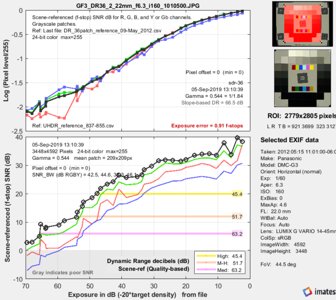 Panasonic G3, ISO 160, in-camera JPEG, run with Color/Tone Auto (Multitest). Note the “shoulder.”
The horizontal bars in the lower plot show the range of exposure for SNRscene-ref = 20, 12, and 6dB.
The human vision perspective:
|

|
\(\displaystyle \text{F-stop noise } = N_{f-stop} = \frac{N_{pixels}}{dS/d(\text{f-stop})} = \frac{N_{pixels}}{dS/d(\log_2 ( L_{scene})}\) \(\displaystyle\text{Using }\ \frac{d(\log_a(x))}{dx} = \frac{1}{x \ln (a)} \ ; \ \ \ \ \ d(\log_a(x)) = \frac{dx}{x \ln(a)} \) \(\displaystyle N_{f-stop} = \frac{N_{pixels}}{dS/dL_{scene} \times \ln(2) \times L_{scene}} ≅ \frac{N_{pixels}}{dS/dL_{scene} \times L_{scene}} \) where Npixels is the measured noise in pixels and \(d(\text{pixel})/d(\text{f-stop})\) is the derivative of the signal (pixel level) with respect to scene luminance (exposure) measured in f-stops = log2(luminance). ln(2) = 0.6931 has been dropped to maintain backwards compatibility with older Imatest calculations. Noting that luminance (exposure) is the signal level of the scene, \(\displaystyle \text{Scene noise} = N_{scene} = \frac{N_{pixels}}{dS/dL_{scene}} ≅ N_{f-stop} \times L_{scene} \) The key to these calculations is that the scene-referenced Signal-to-Noise Ratio, calculated from the measured signal S and noise Npixels must be the same as the scene SNR, which is based on Nscene, which cannot be measured directly. \(\displaystyle \text{Scene Signal-to-Noise Ratio} = SNR_{scene} = \frac{L_{scene}}{N_{scene}} = \frac{1}{N_{f-stop}} = \text{Scene-referenced SNR} = SNR_{scene-ref} \) the equation for Scene-referenced noise, \(N_{scene-ref}\), which enables \(SNR_{scene-ref} = SNR_{scene}\) to be calculated directly from \(S/N_{pixels}\) is given above. Displays in Stepchart, Color/Tone Interactive, and Color/Tone Auto offer a choice between f-stop noise or Scene-referenced SNR (expressed as a ratio or in dB). Note that SNRscene-ref decreases as the slope of the tonal response curve decreases (often the result of flare light in dark patches). |
The above-right image illustrates how the pixel spacing between f-stops (and hence d(pixel)/d(f-stop)) decreases with decreasing brightness. This causes f-stop noise to increase with decreasing brightness, visible in the figures above.
Since f-stop noise and scene-referenced SNR are functions of scene luminance, largely independent of image signal processing and fogging from flare light, they are an excellent indicators of real-world camera performance. They are the basis of Imatest Dynamic Range measurements.
↧